How has study-abroad changed my life?
Sunday, March 21st, 2010 in: News, Travel
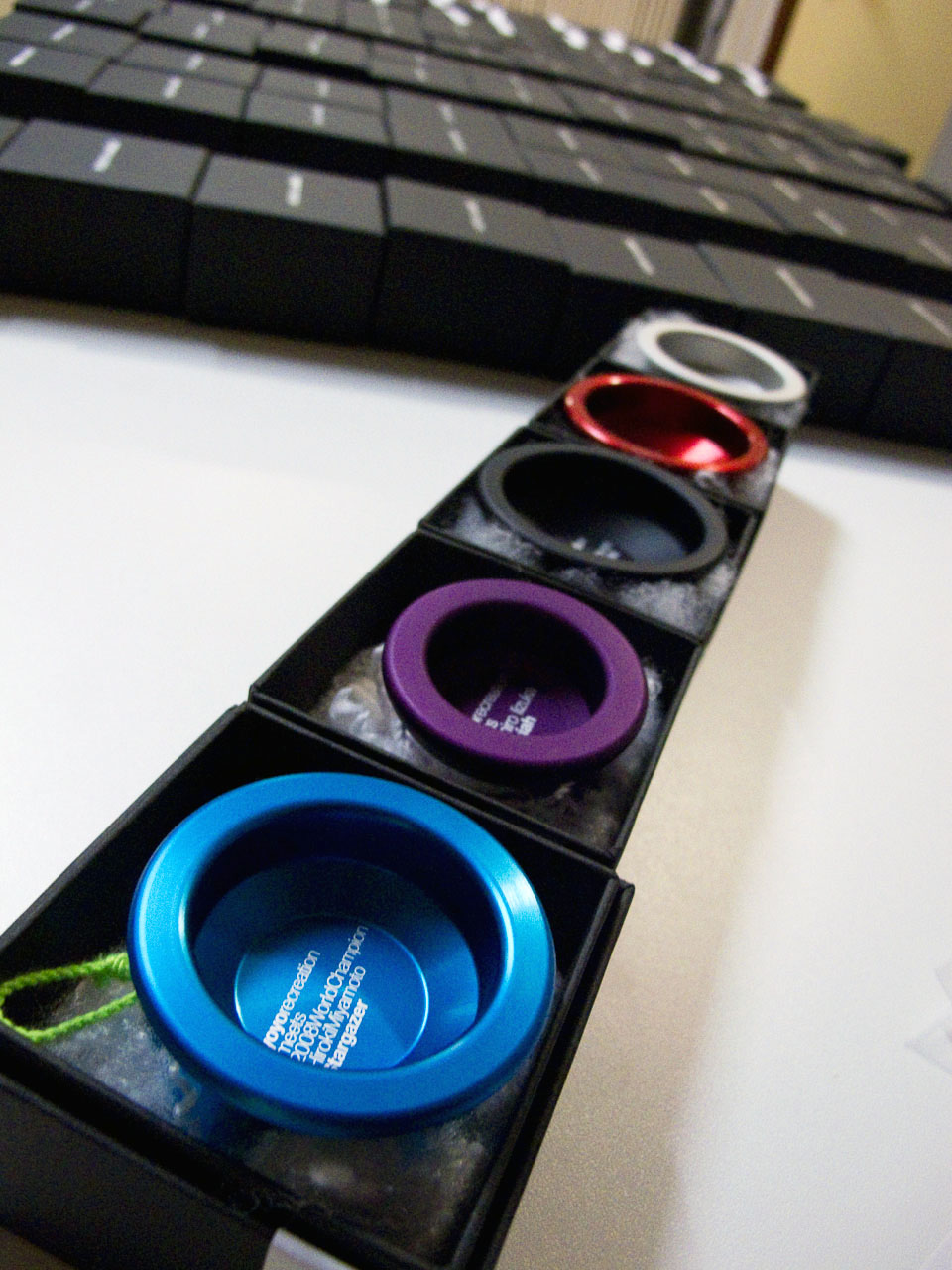
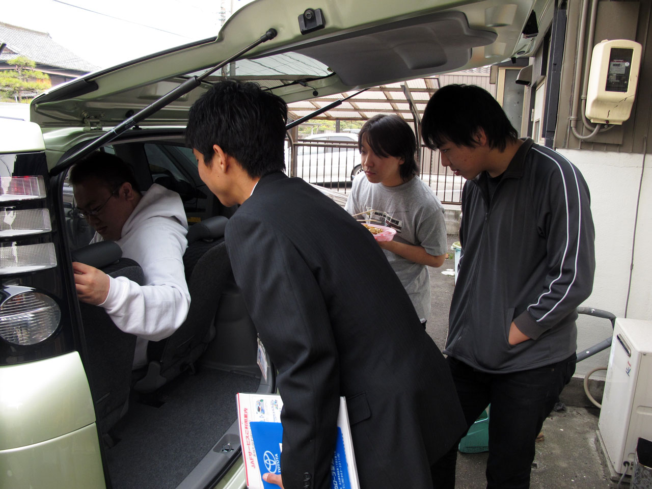
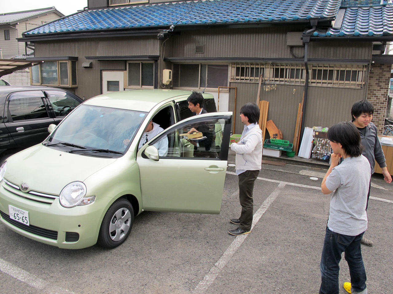
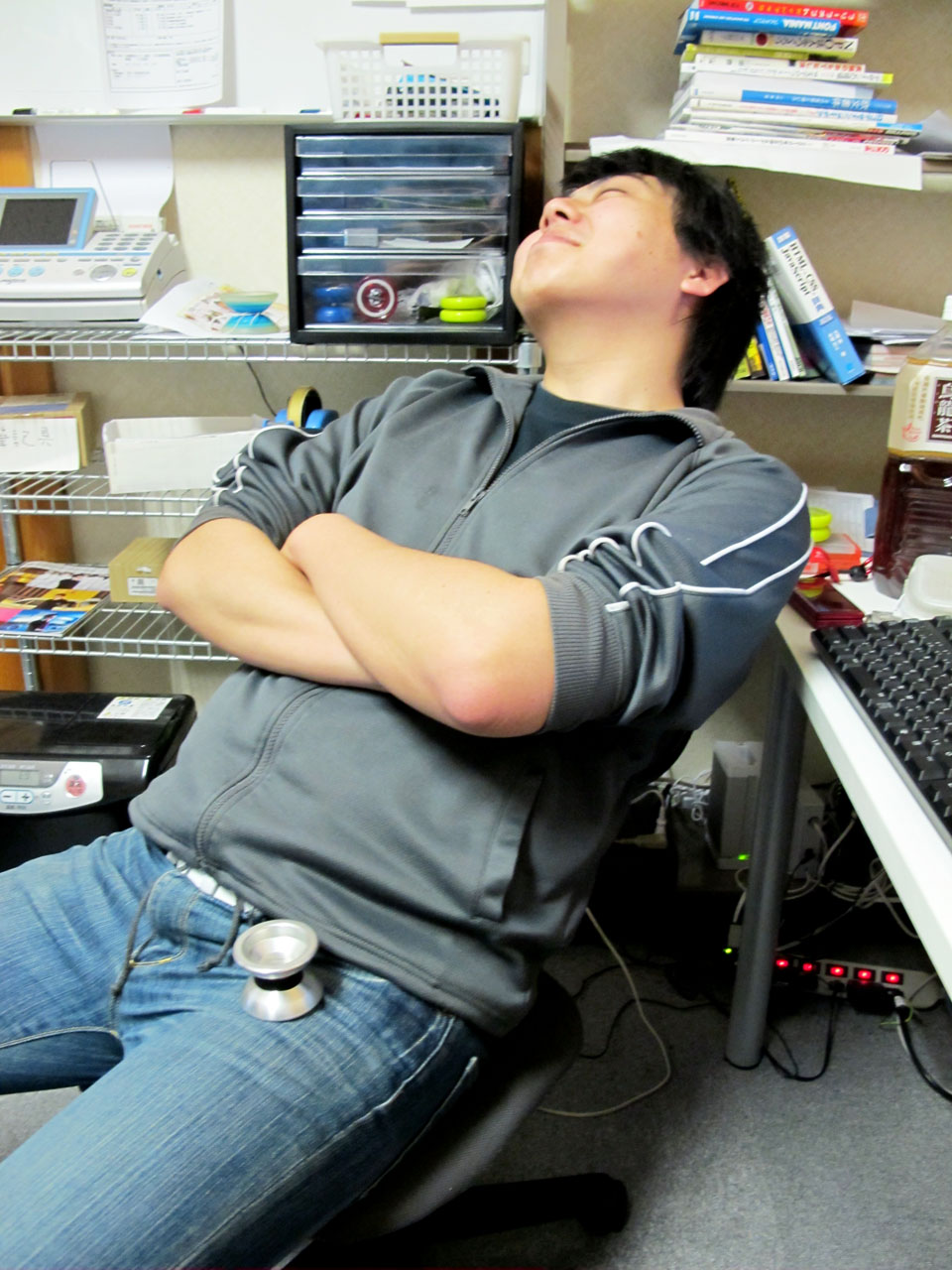
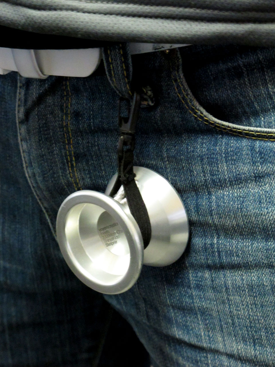
So, as you might’ve have figured out, I live and work in Japan (albeit temporarily), and I owe it all to studying abroad. I met Hiro through a fellow CSU exchange student at Waseda, and three years after I came back to the states, he offered me this job which has been the catalyst for this little jaunt around the world. Another former exchange student has asked me to put together a little video explaining how things are going, and how my time abroad has made an impact on my life. I’ve also written a little bit to accompany the video. I hope you have as much fun watching is as I did making it. Sorry there isn’t more yo-yo in it, I had to keep it under 10 minutes!
httpvh://www.youtube.com/watch?v=-F25kyz_-w8
A little about my experience… (more…)
Gibbon Slackline Review
Friday, March 19th, 2010 in: News, Reviews

Please note: this review was written mainly for the Gibbon Classic Slackline Kit. I have since tried some other Gibbon kits, including the Jibline, for which I might write a separate review.
Working in an office all day across the street from where I live, I have to make my own opportunities to exercise. Yo-Yoing can only burn so many calories! It’s times like this that I’m so glad I brought my slackline with me. I’ve gotten so used to the setup, I can have a line up or down in a matter of minutes, and in addition to the great workout it gives, it’s been an unexpected social tool. Every time I go play in the park, the local kids climb around on it and ask questions; here it’s best described as 綱渡り, tightrope walking, since “スラックライン” doesn’t quite get through the language barrier. I’m glad to be an ambassador for slackline, although I’m usually sacrificing my own playtime to teach the kids and let them jump around on the line.
Some of the local yo-yo and diabolo players caught wind of my hobby, and have joined in on the fun. Kazuya and Nobu (ディア/ジャグラー系) have really gotten into it, and decided to buy their own line. Good webbing is a little harder to find here, and carabiners are ridiculously expensive, but with a little searching, the guys found that kits are readily available online, and it seems that the most common lines are made by Gibbon. At only about 40-50 bucks, it’s a pretty decent deal for a 15m line. When I first got into slacklining, kits cost more than $100, so it seems that they’re much more affordable than they used to be. I’ve had an opportunity to play around on their new kit a little, and I thought I’d write a little review on it… (more…)
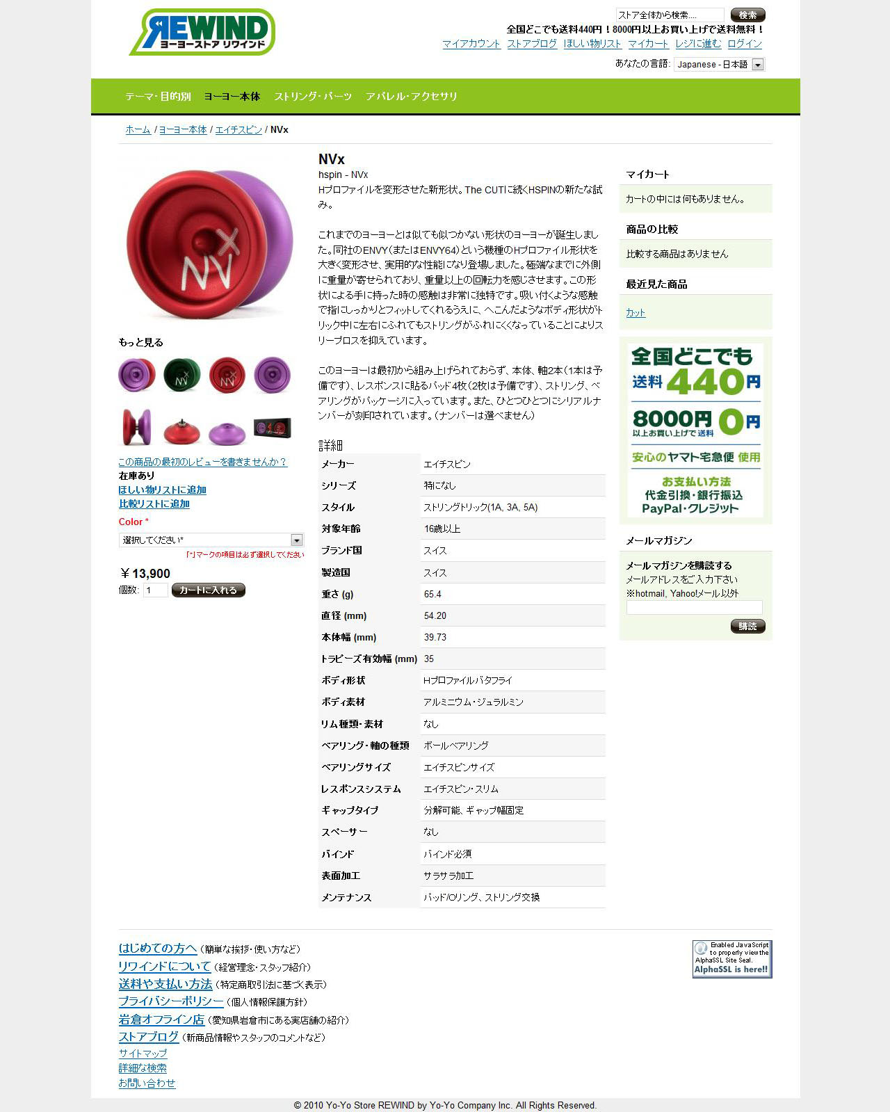
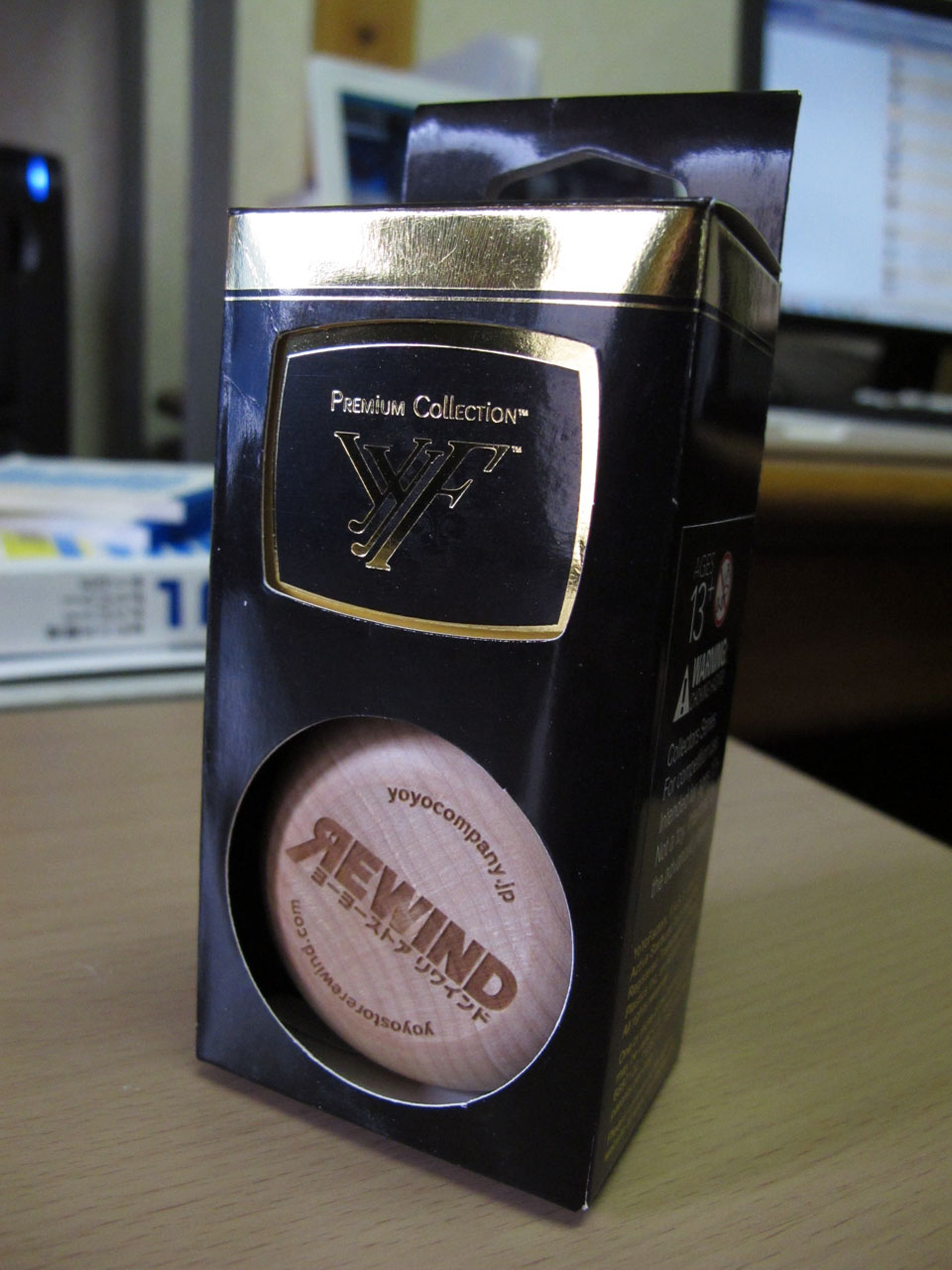
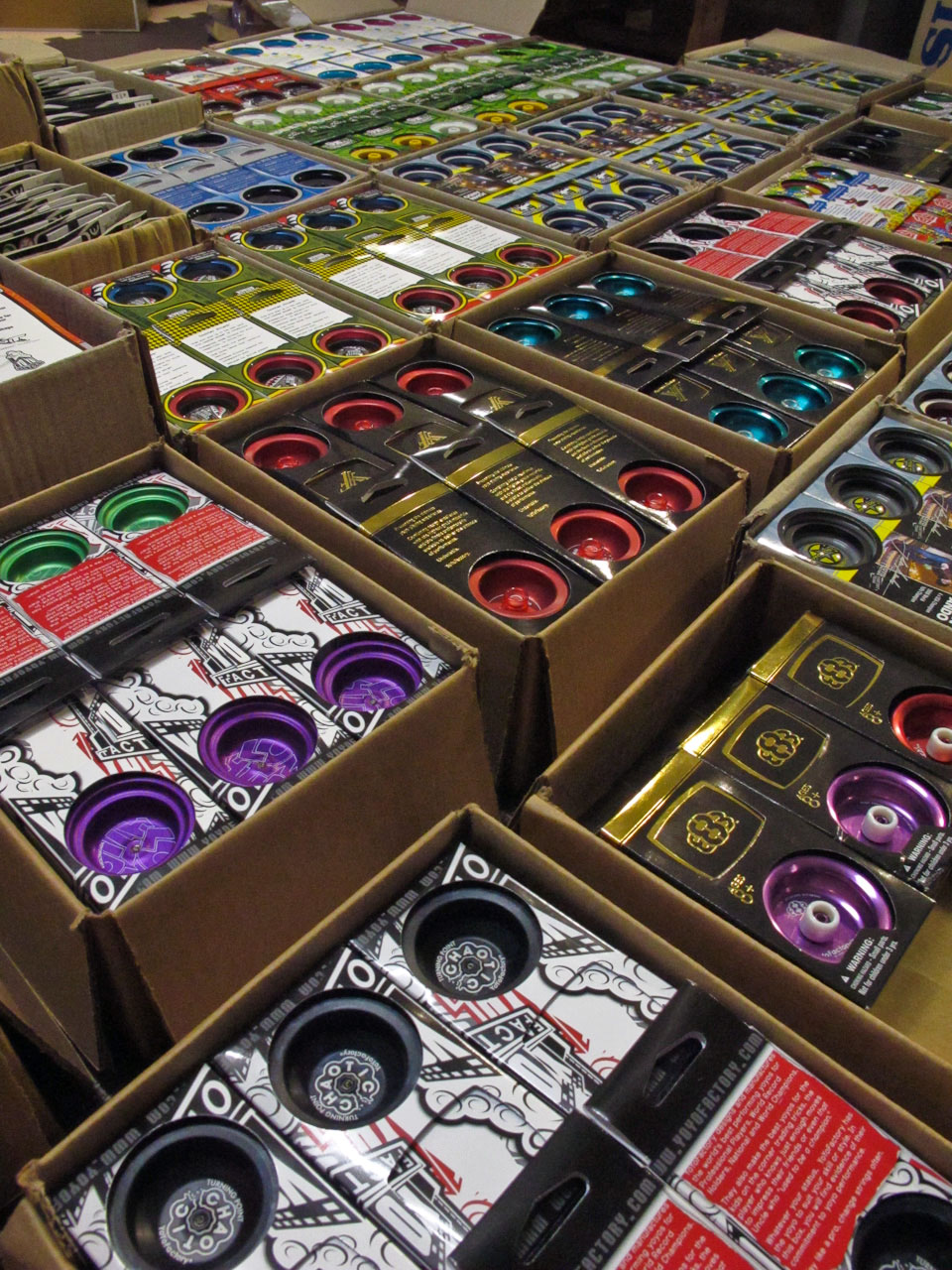
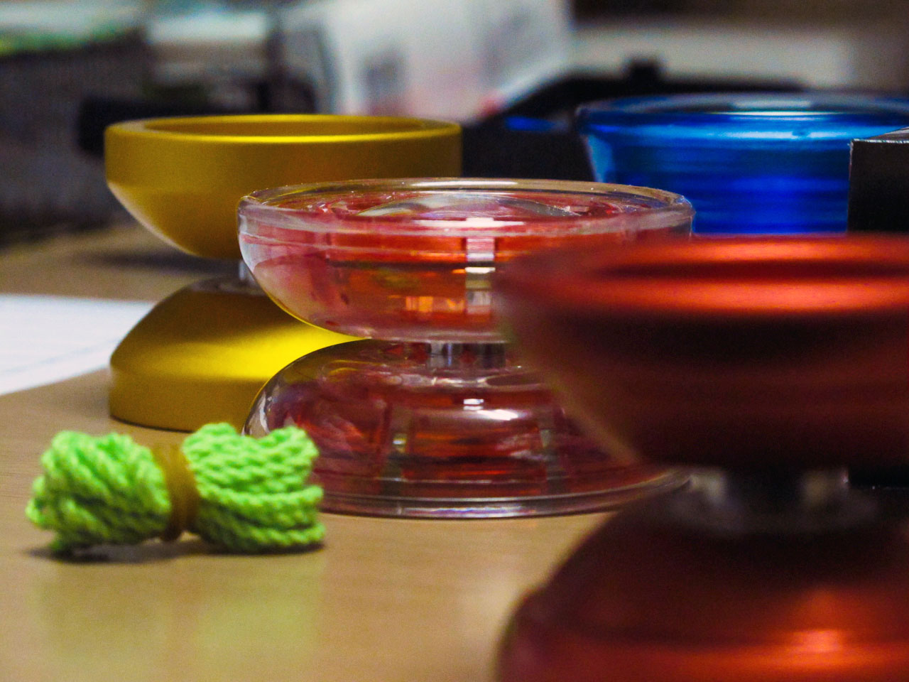
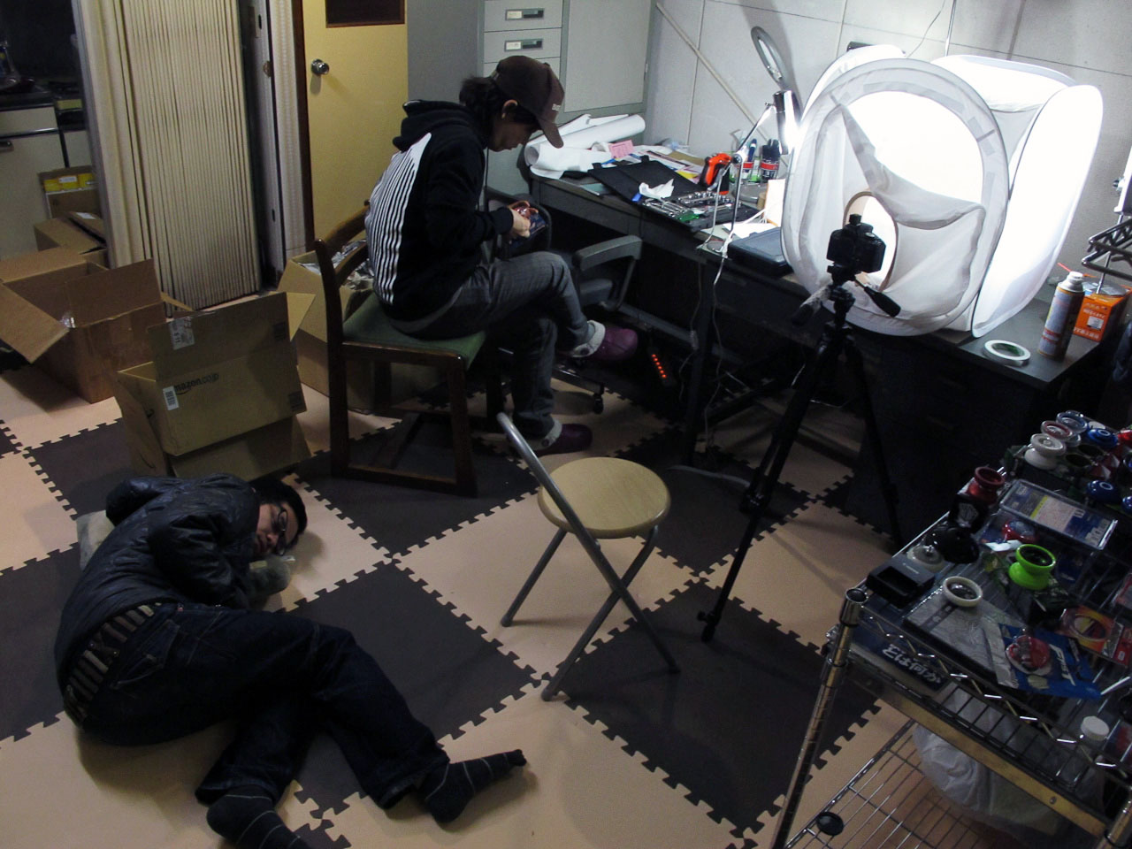
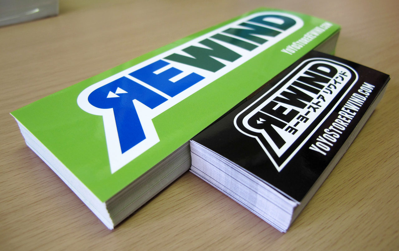
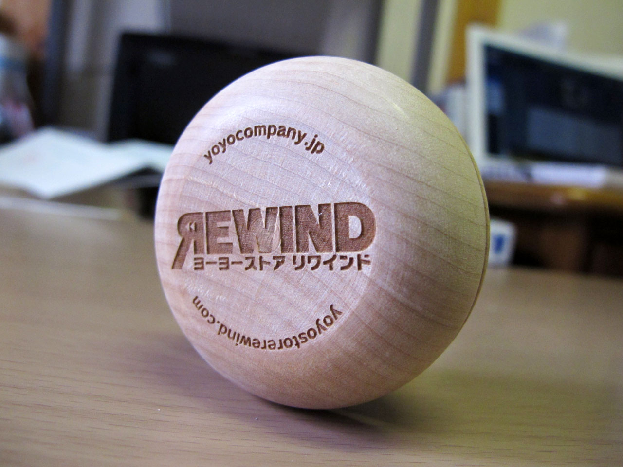
Product Photos for REWIND
Friday, March 19th, 2010 in: Photography

In addition to doing the brand identity, graphic and web design for REWIND, I also provided my services as a product photographer. Currently all of the photos on the site were taken and processed by myself, but I am training one of my coworkers to take over this task when I leave. These are just a few examples of my work. (more…)
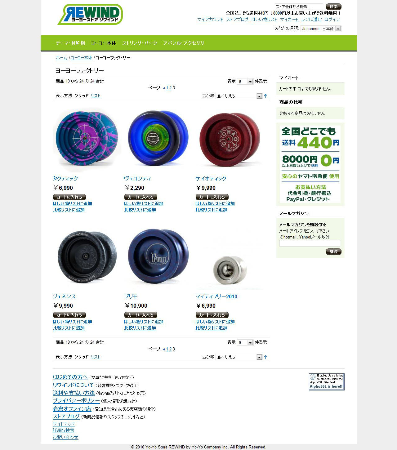
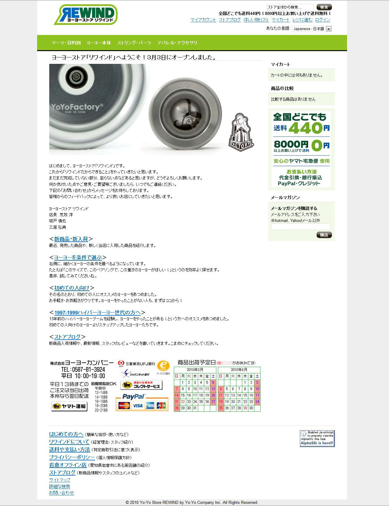
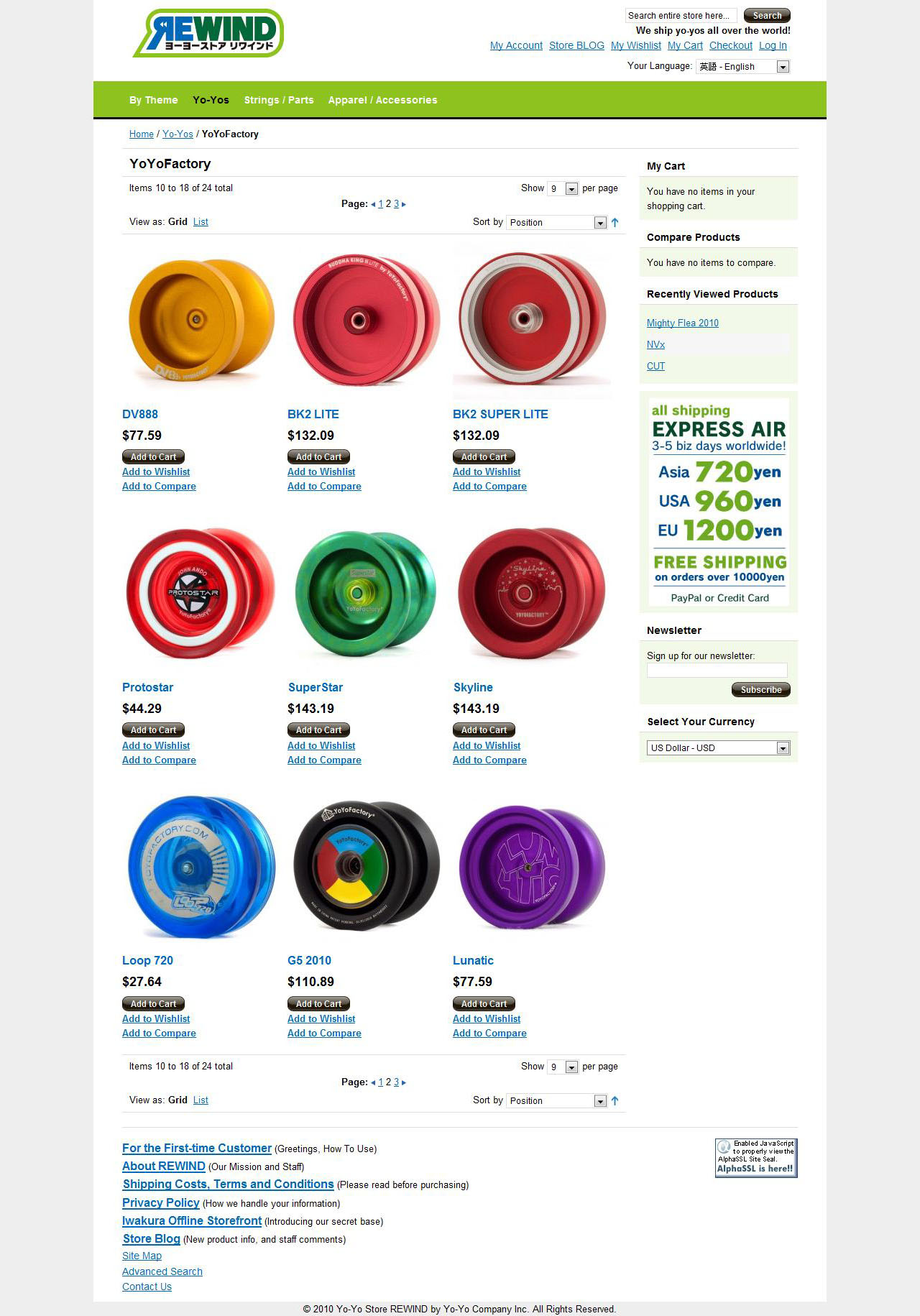
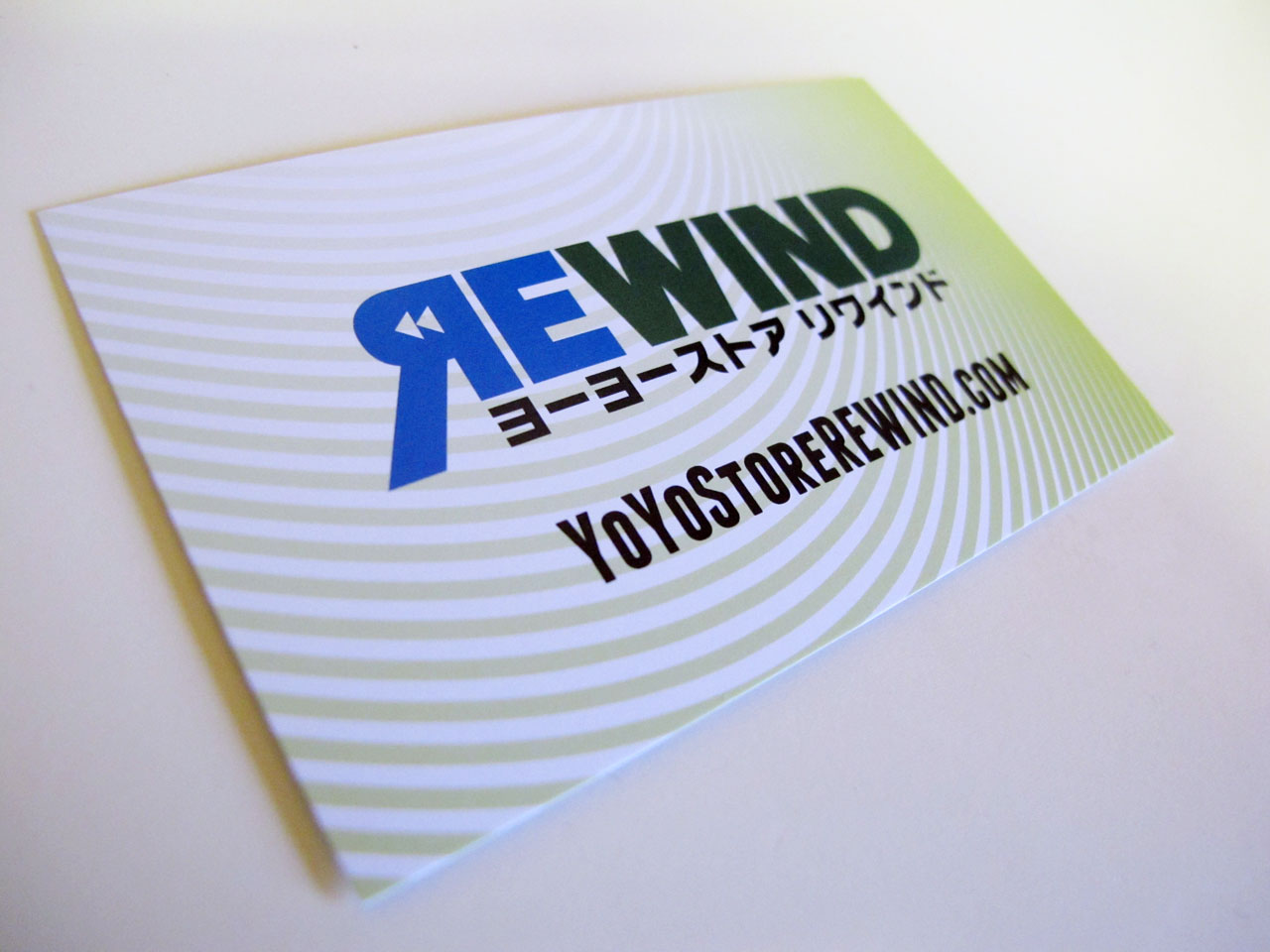
YoYoStoreREWIND.com and RWND.jp
Friday, March 19th, 2010 in: Web
Site designs for www.yoyostorerewind.com. Its mirror, www.RWND.jp is simply a portal site which directs you to the .com, with the option of either choosing English or Japanese. The languages are hot-swappable within the site as well.
REWIND boasts a sophisticated e-commerce backend and one of the cleanest information hierarchies in the yo-yo world. It also provides users with several ways to browse for products, from broad categories like experience levels and manufacturers, to extremely specific details like bearing type, weight, diameter and body type. REWIND is the new benchmark in online yo-yo shopping experiences.

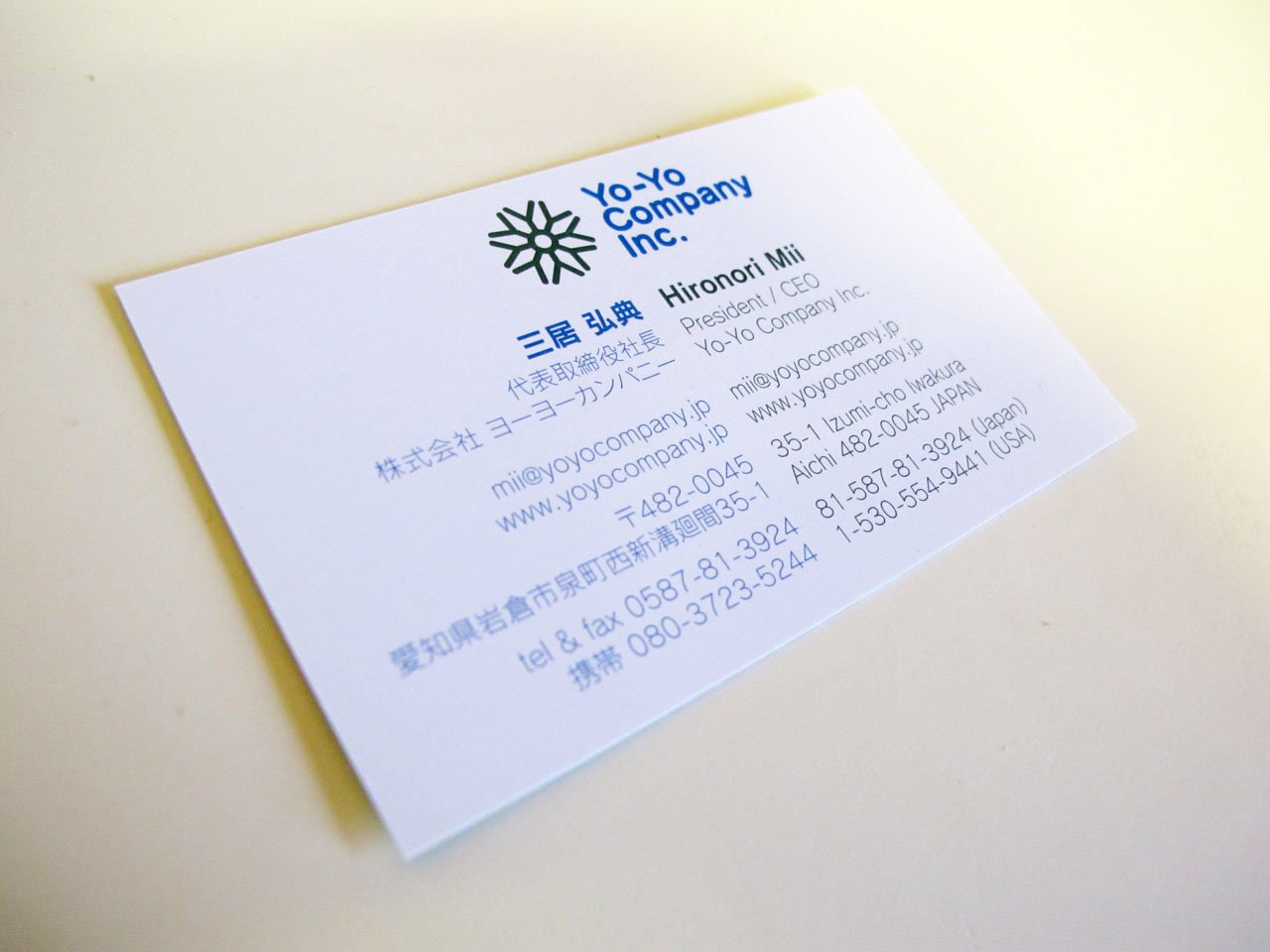
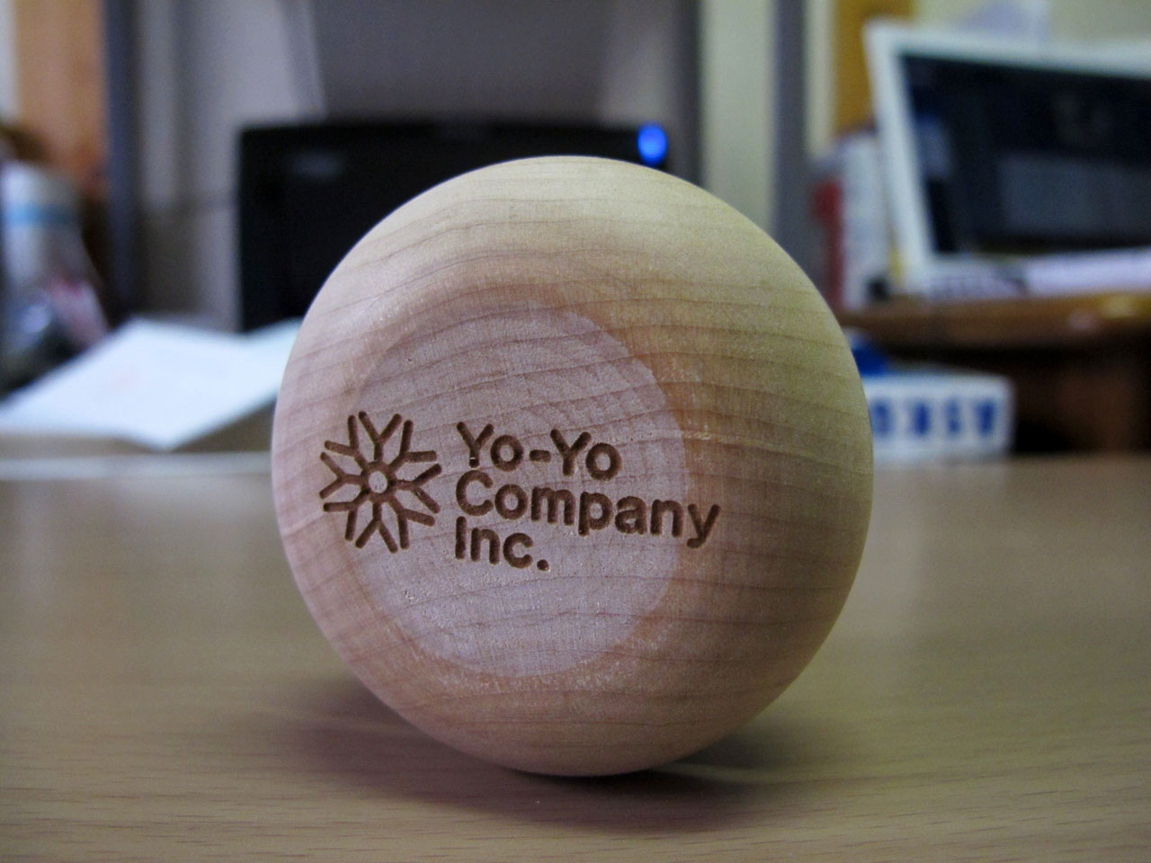
Yo-Yo Company Inc Identity
Friday, March 19th, 2010 in: Identity
![]()
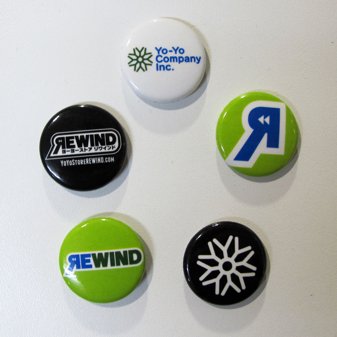
Brand Identity for 株式会社ヨーヨーカンパニー, Yo-Yo Company Inc. www.yoyocompany.jp
The mark is derived from the repeated shape of the letters Y and O, creating a pinwheel effect to represent the rotation of a yo-yo. The shape was inspired by Japanese Kamon (family crests, not unlike Feudal coats of arms), an area of ancient design I find particularly interesting. The letter shapes are based on Fontworks FOTスーラ font.
Because of its close association with the REWIND subsidiary, Yo-Yo Company Inc shares the same color scheme as the online yo-yo store.

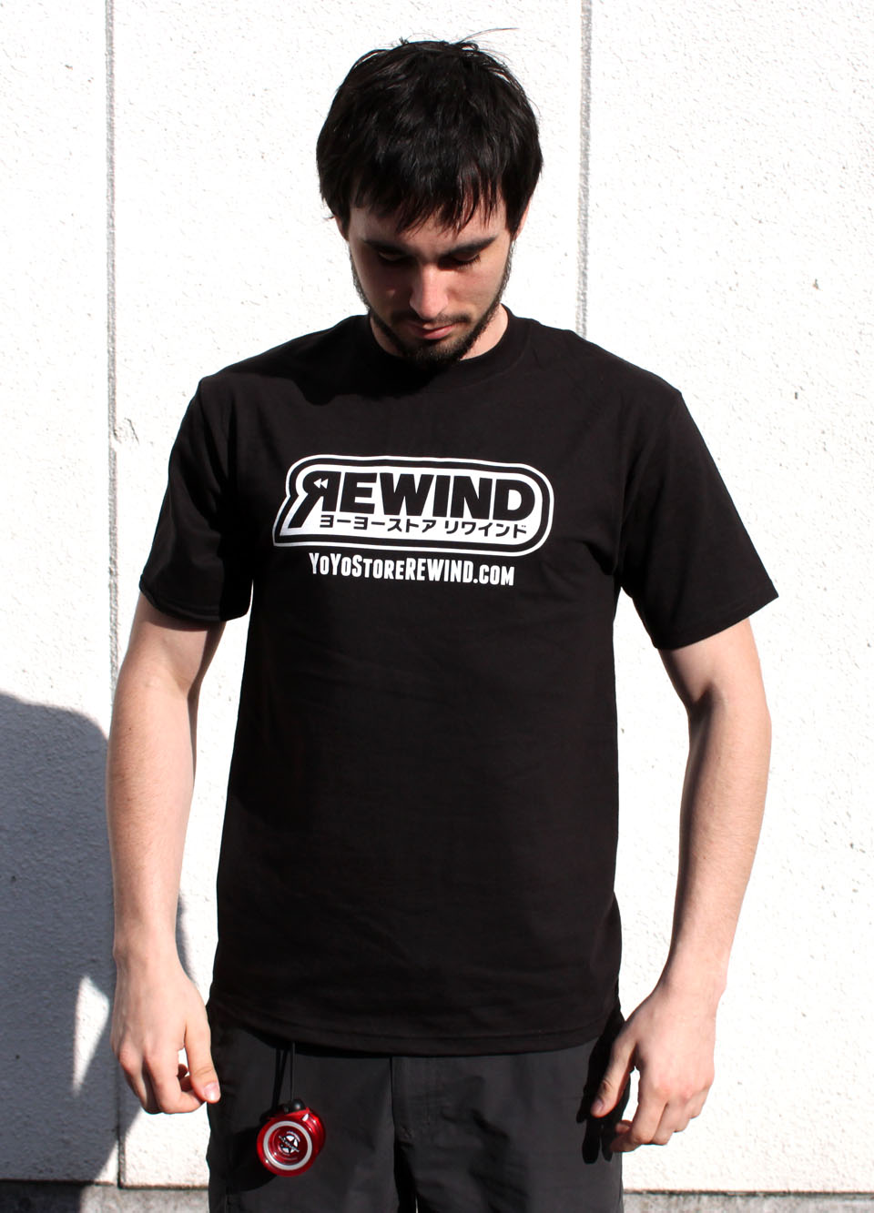
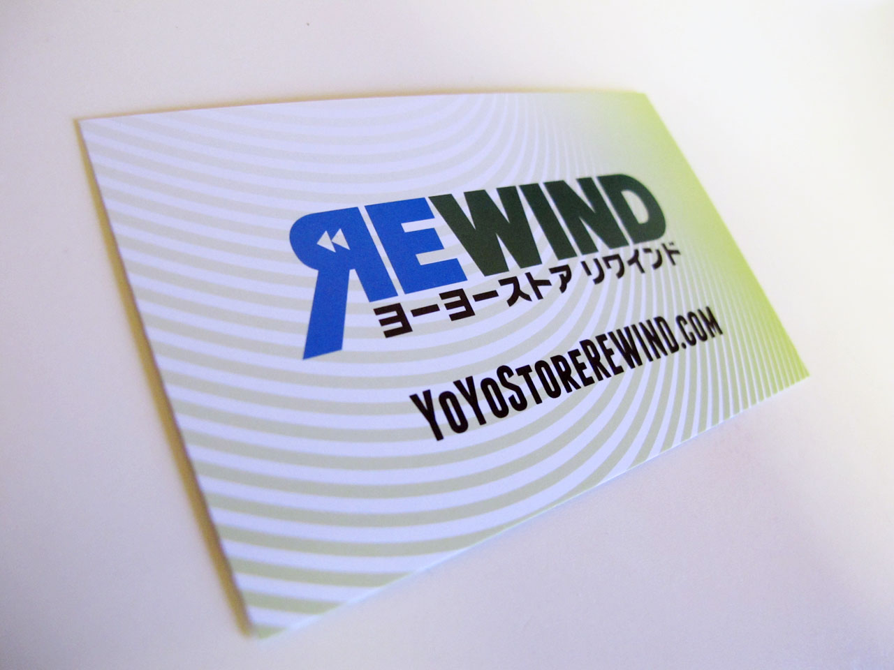
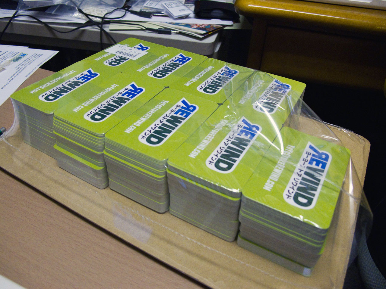
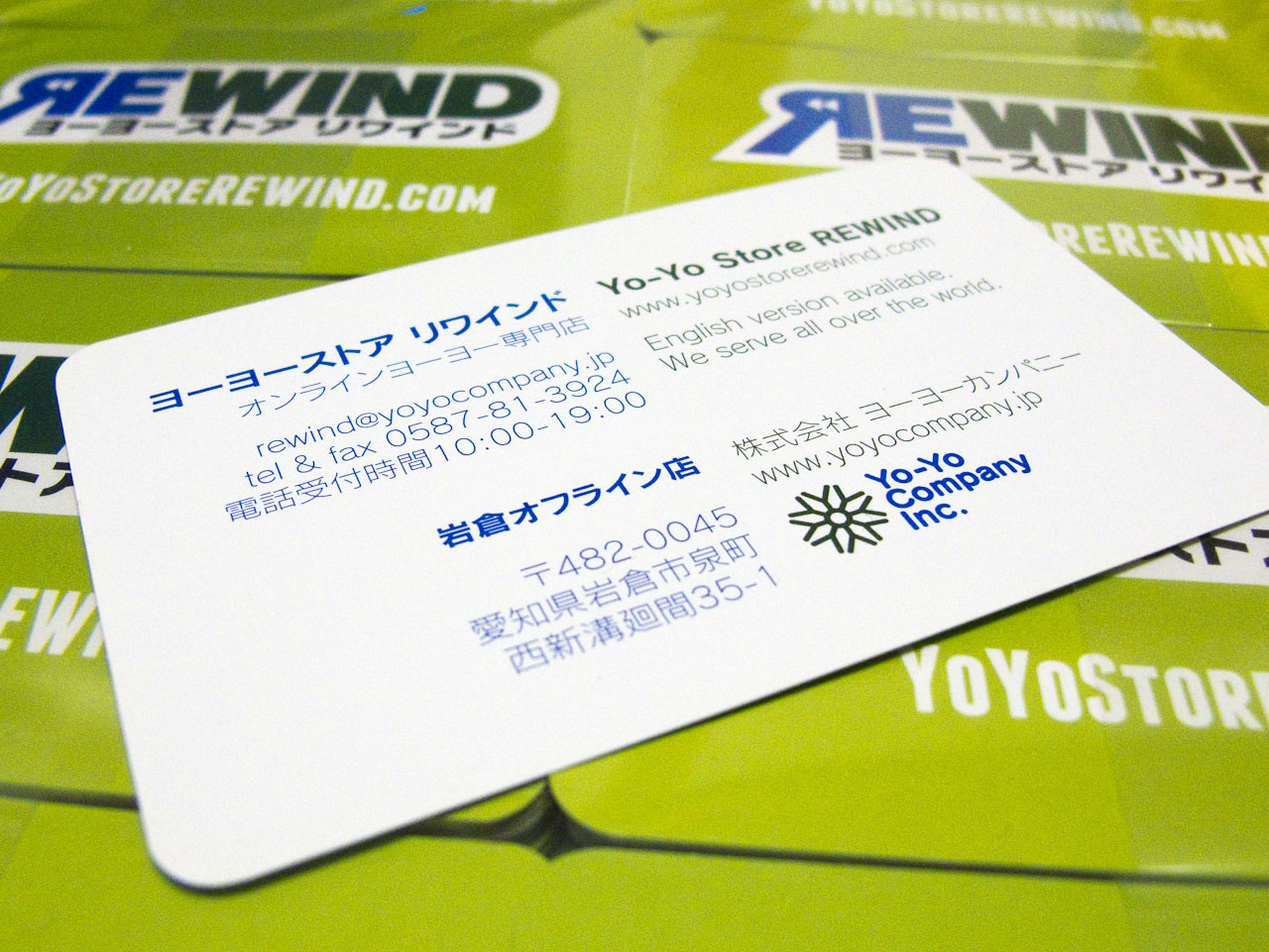
REWIND Store Identity
Friday, March 19th, 2010 in: Identity
![]()
The Store identity for Yo-Yo Store REWIND, www.yoyostorerewind.com and www.RWND.jp
The logo is based on some wordplay, reversing the shape of the R and using the traditional “rewind” icon from the days of VCR technology; a visual metaphor for the revival of our old friend, the yo-yo. The font is a highly modified Fontworks FOTロダンNTLG Pro demi-bold typeface.
Encapsulated in a stroke or series of strokes, depending on the application and environment, the shape of the logo is similar to a “speech bubble,” an element that will be explored later once the brand has established itself. Once the public associates these visual styles and colors with REWIND, the backwards R shape is intended to become a standalone visual element in the future as well.
The color scheme is an analogous “transparency” of blue and yellow-green, creating the dark green middle ground. This creates a layered dimensional effect to the logo without having to use extraneous elements.


REWIND Grand Opening
Friday, March 19th, 2010 in: News, Travel

Ok, so we technically opened March 3rd, but it’s taken me a while to get around to actually write about it. It’s been a long road to get here and there is still much left to brand development beyond creating and applying a logo and visual style, but the conceptual foundation has been laid and the first round of design collateral has been sent off into the real world. So far, the response has been favorable.
Of course, I’ll never be completely satisfied with any work, but I’m generally happy with the solution I created for Yo-Yo Company Inc and REWIND. I was on time and under budget and my clients are very satisfied with my work, so much so that my initial salary has been tripled given the extent of all the work I’ve done in the past month and a half, and I’ve been given an open invitation to work from abroad and come back when my travels are over. Considering how hard I tend to be on myself, it’s always reassuring when people are so forward about how much they appreciate the work I do.
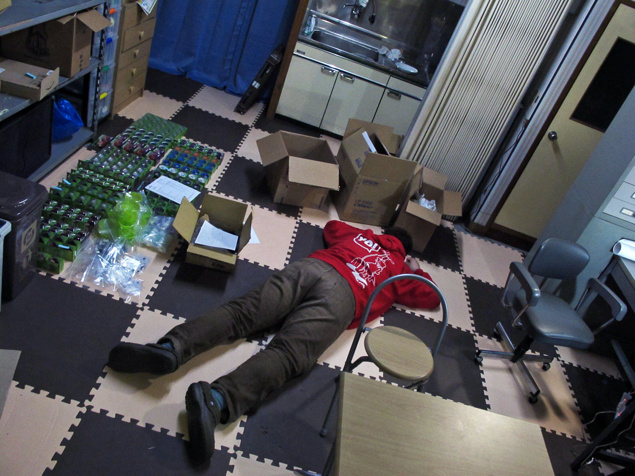
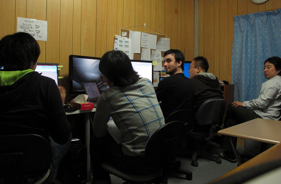
Here are a few square pegs that don’t fit into the round holes of portfolio pieces, but give you a bit of a glimpse into my time here at the office.

Run-up to the Opening
Sunday, March 14th, 2010 in: News, Travel
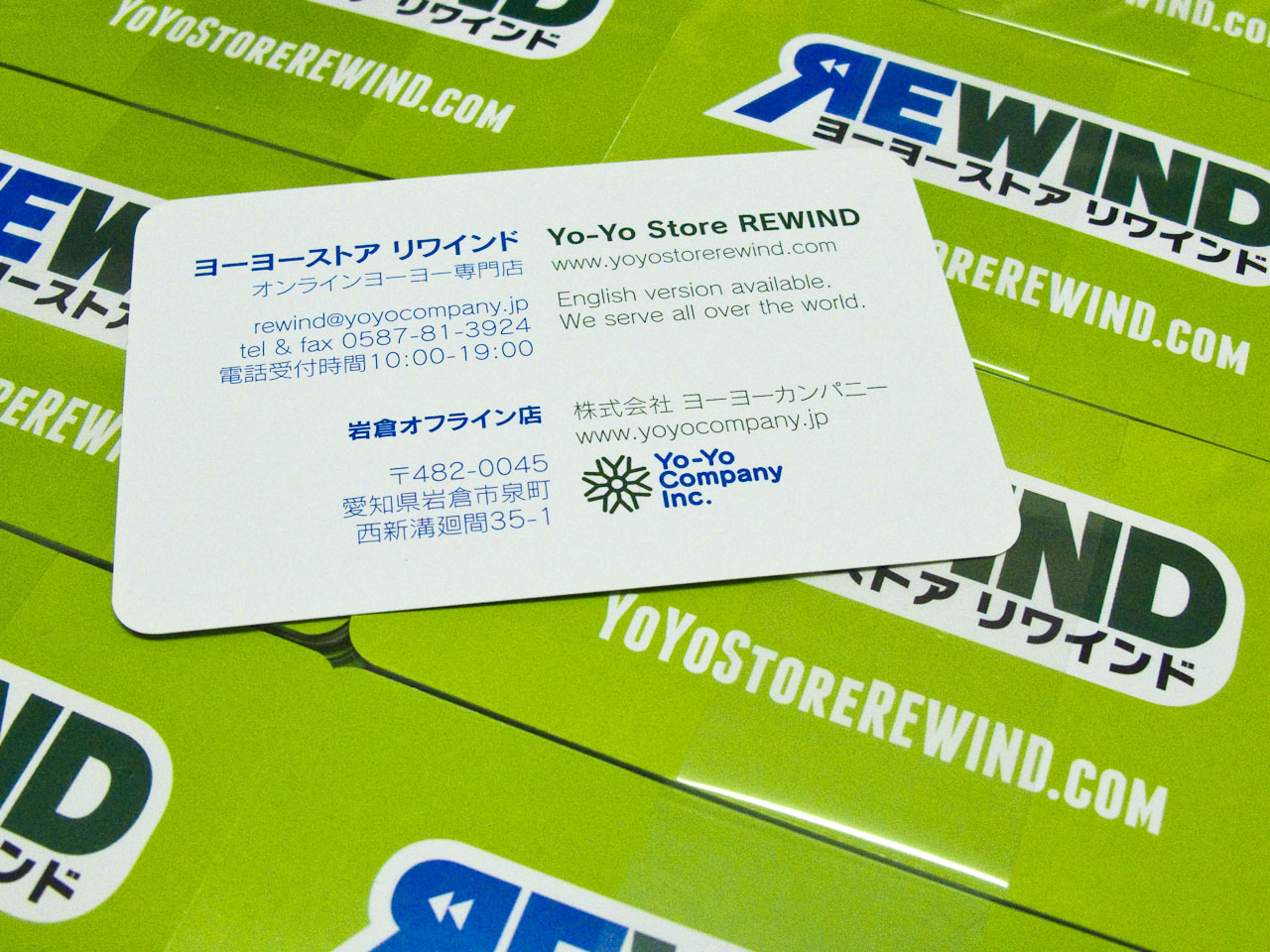
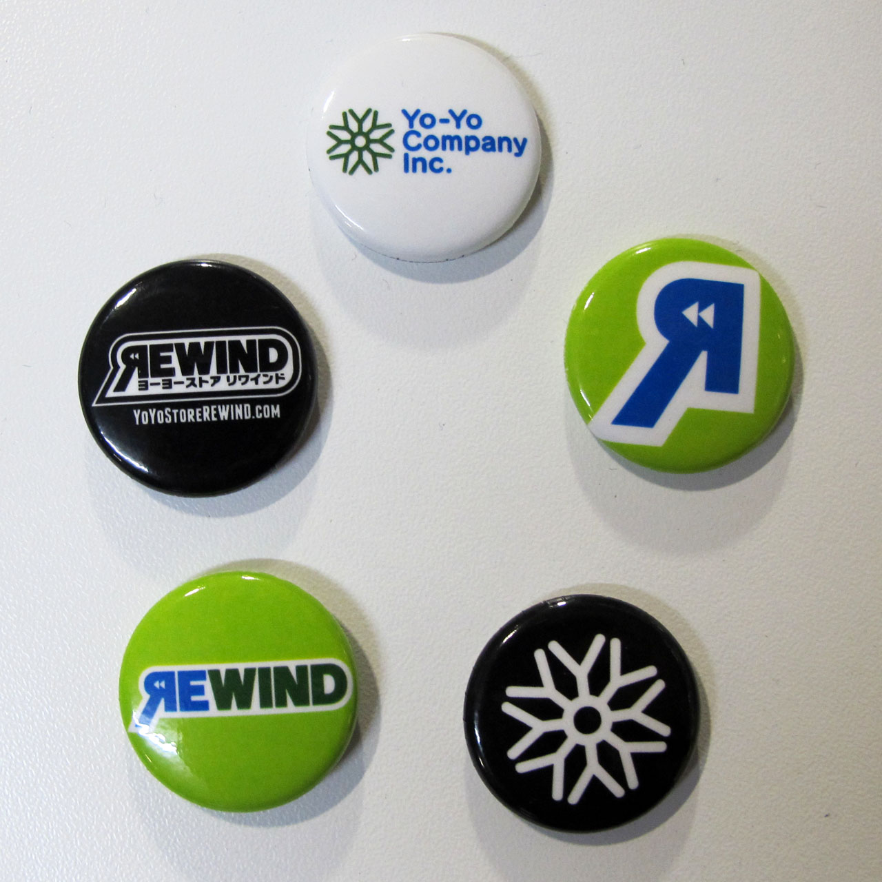
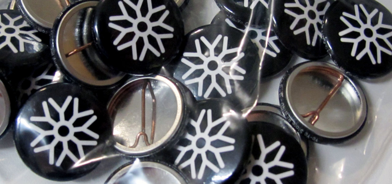
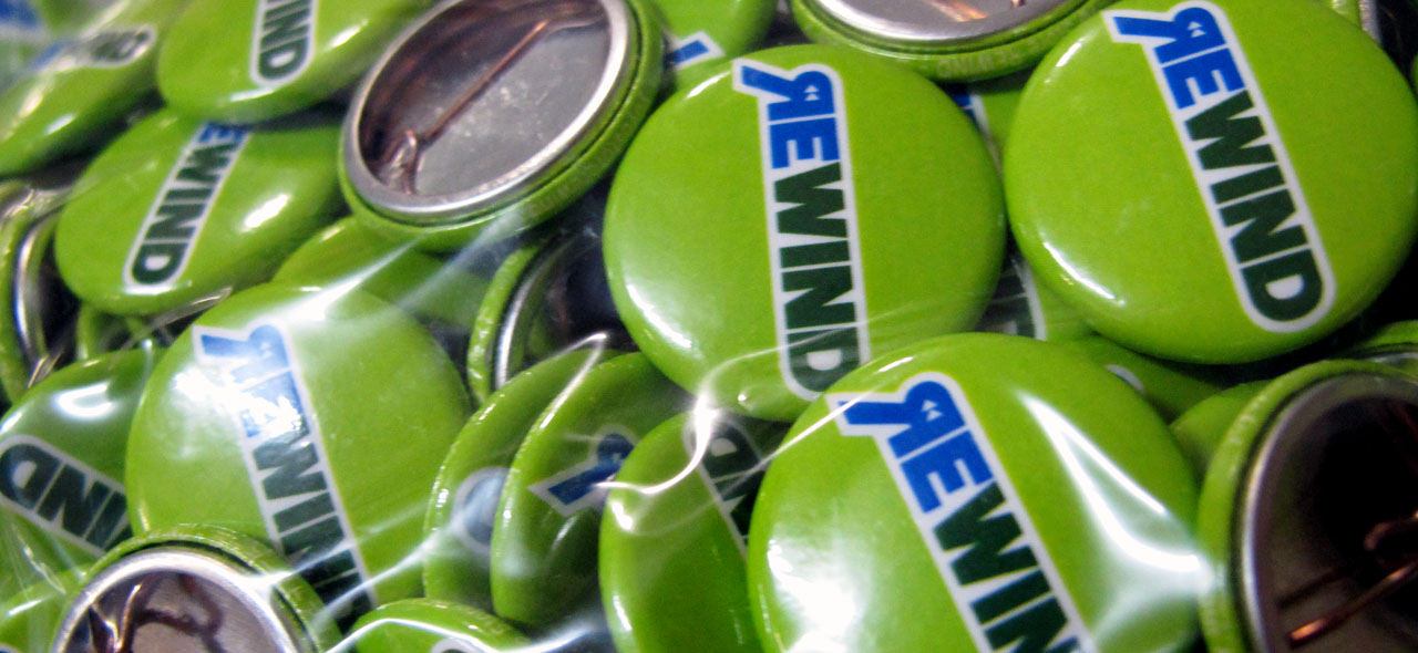
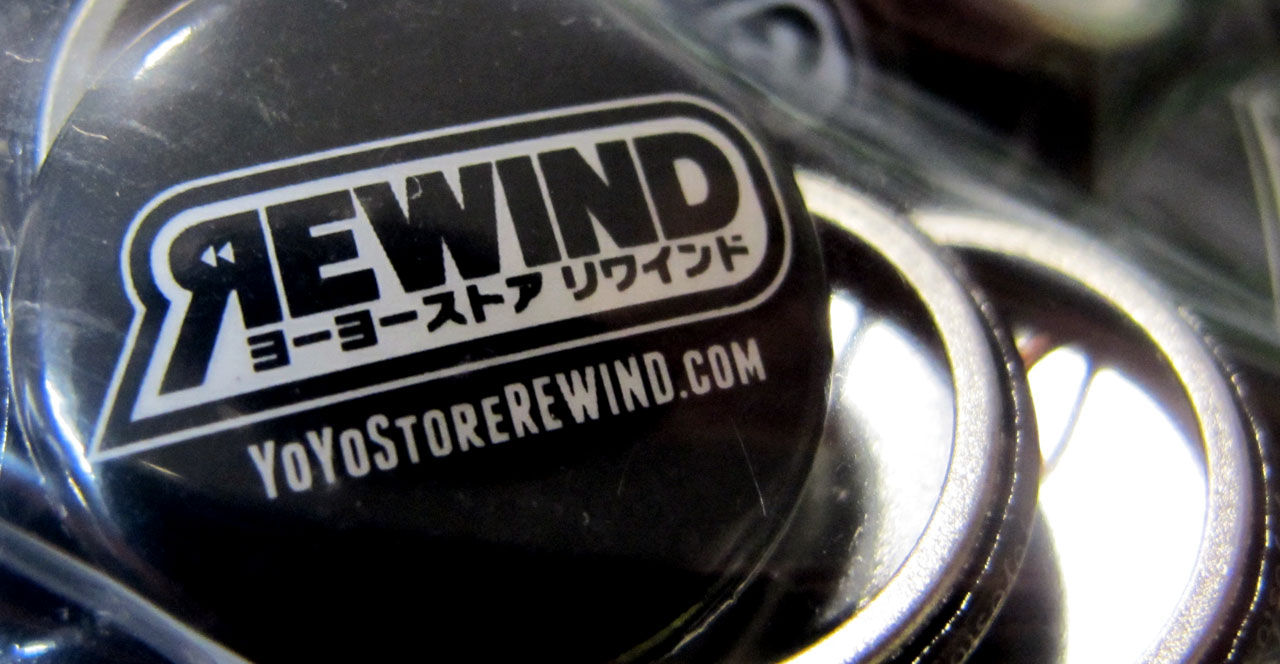
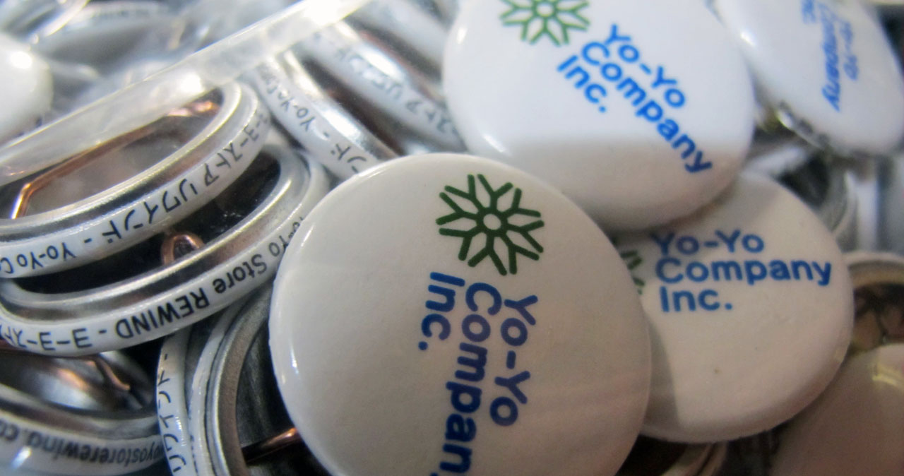
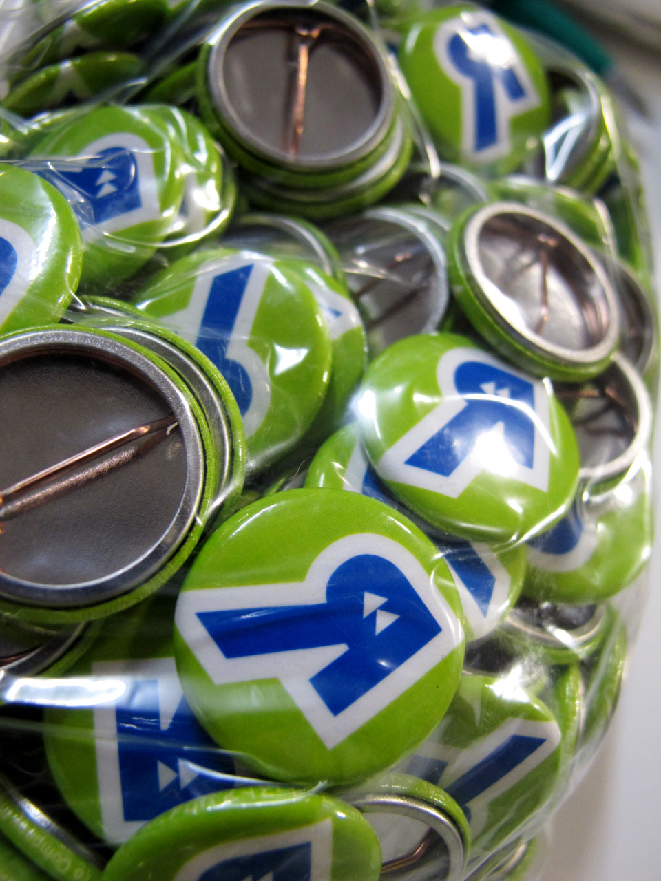
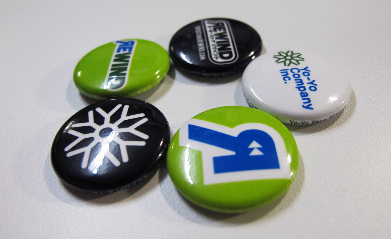
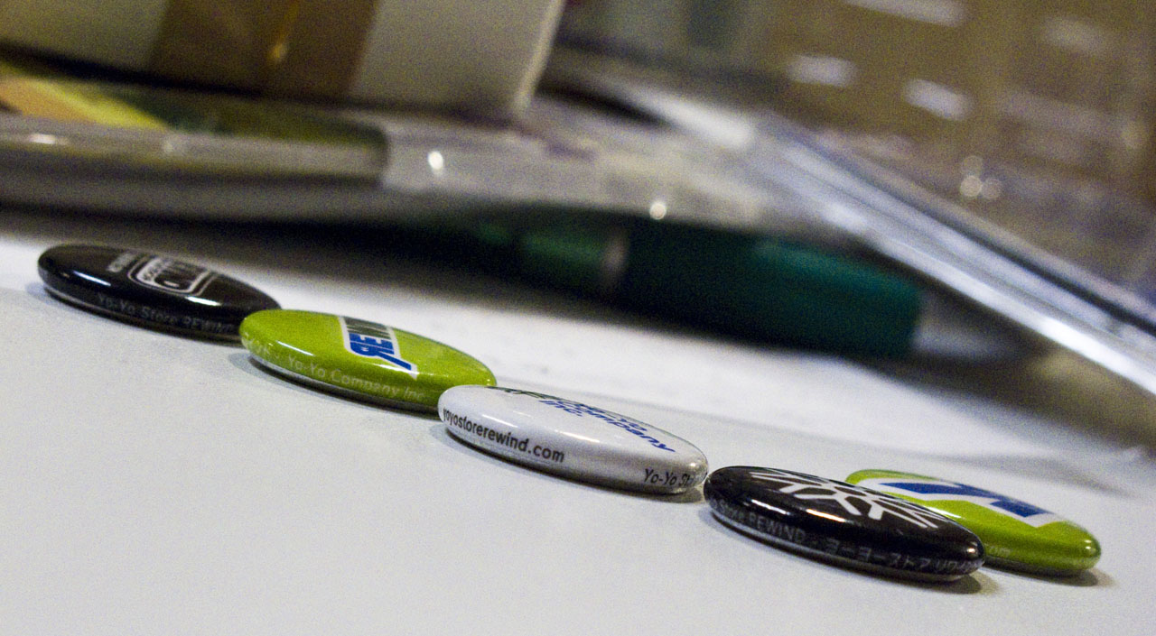
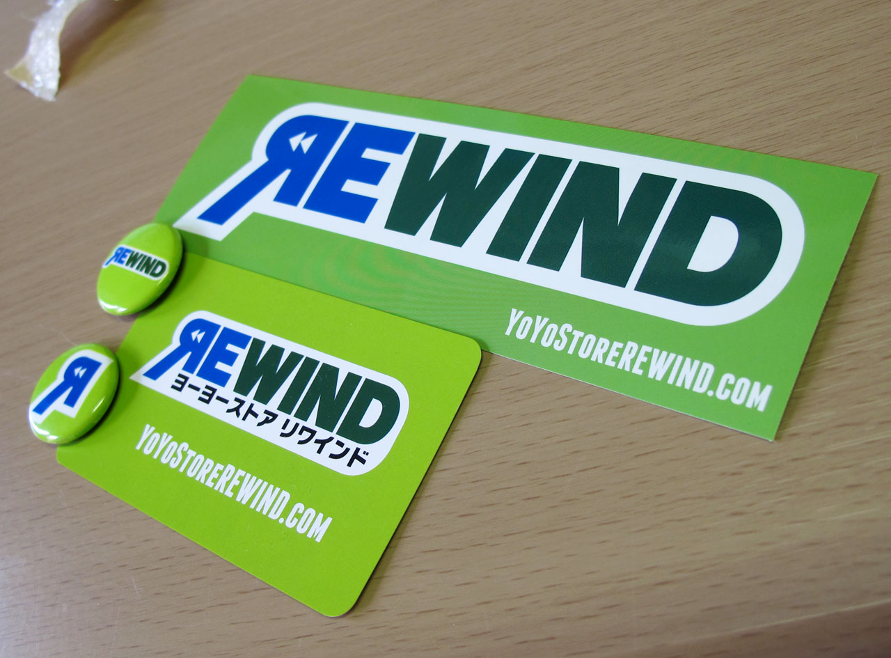
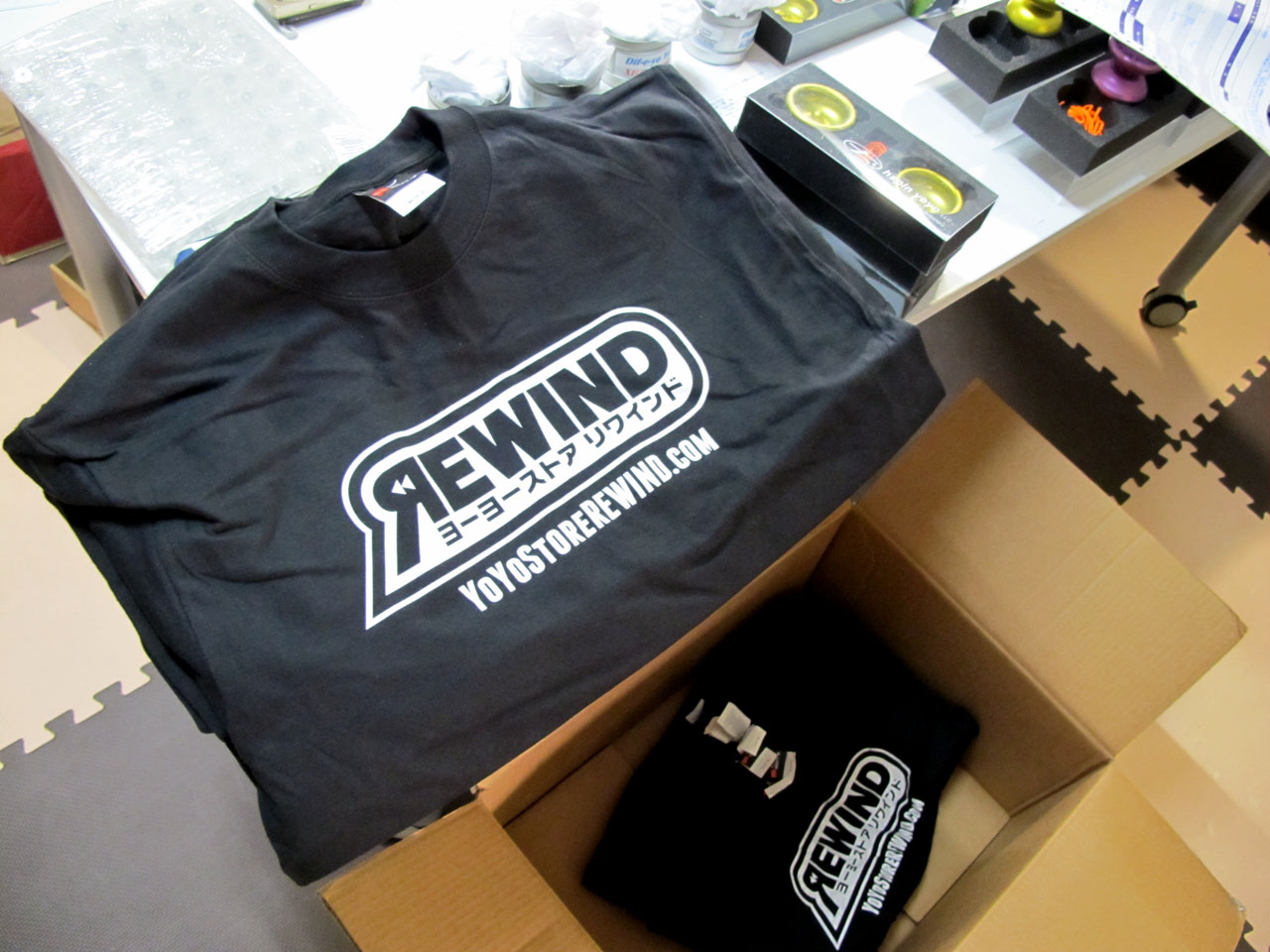
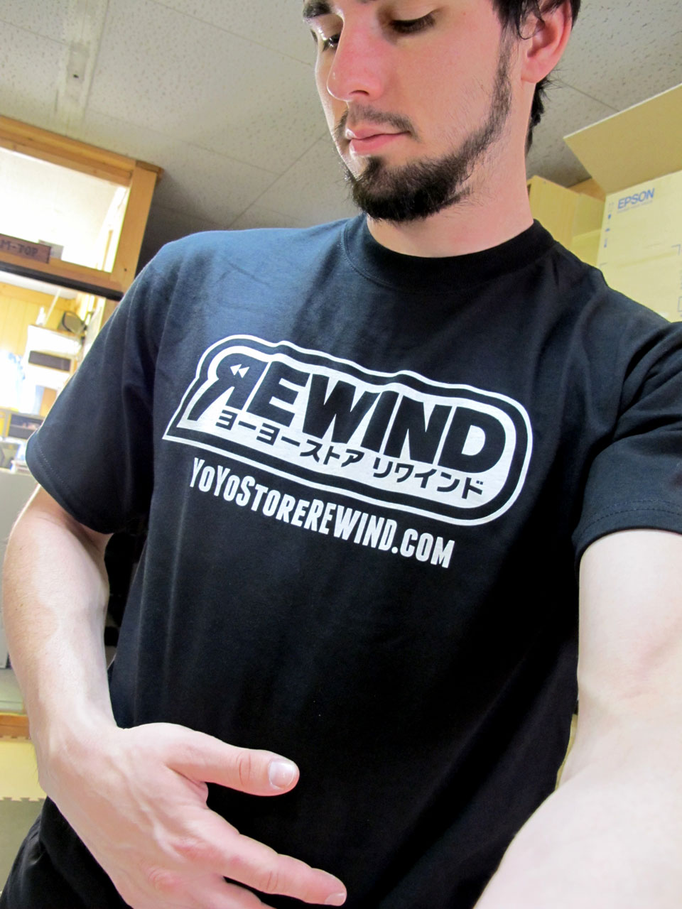
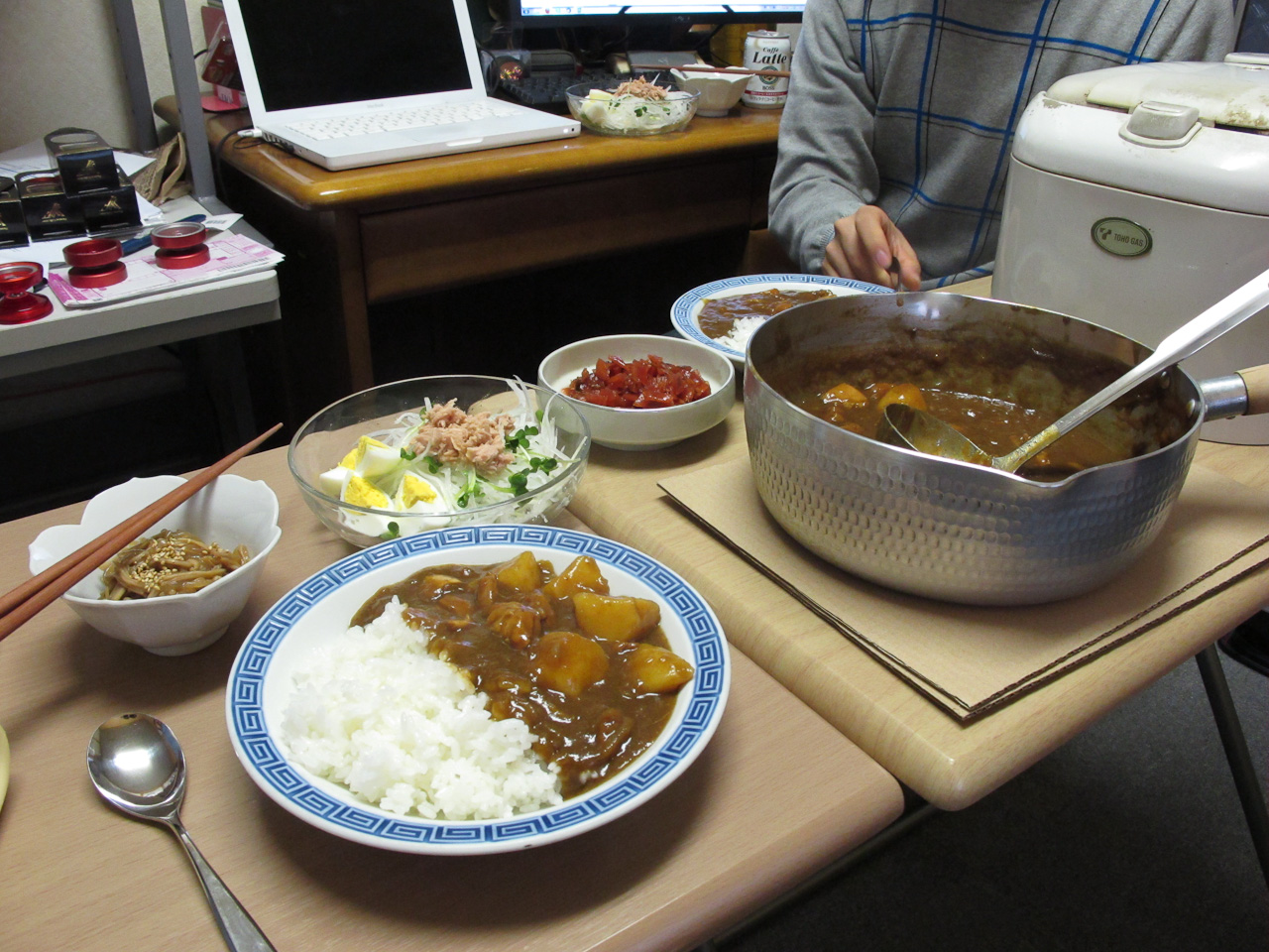
More work, more late nights, more delicious food. The progress continues, and I’m getting closer to being able to share it with you. We’ve ordered some stickers and “can badges,” which are basically like buttons, as well as “store cards” to help promote our site to people we run into on the street. Business cards are almost ready to be ordered; we just need to finalize everyone’s titles. In other words, “Cockroach Herder” probably shouldn’t make it to the final card, as funny as it is. T-shirts are also ready to be ordered, and we’ve already submitted our logo to the Asian Pacific Competition (next month in Singapore) to prominently display, as we are a main sponsor of the event. In other words, my work is about to hit the yo-yo scene in a big way. Exciting!
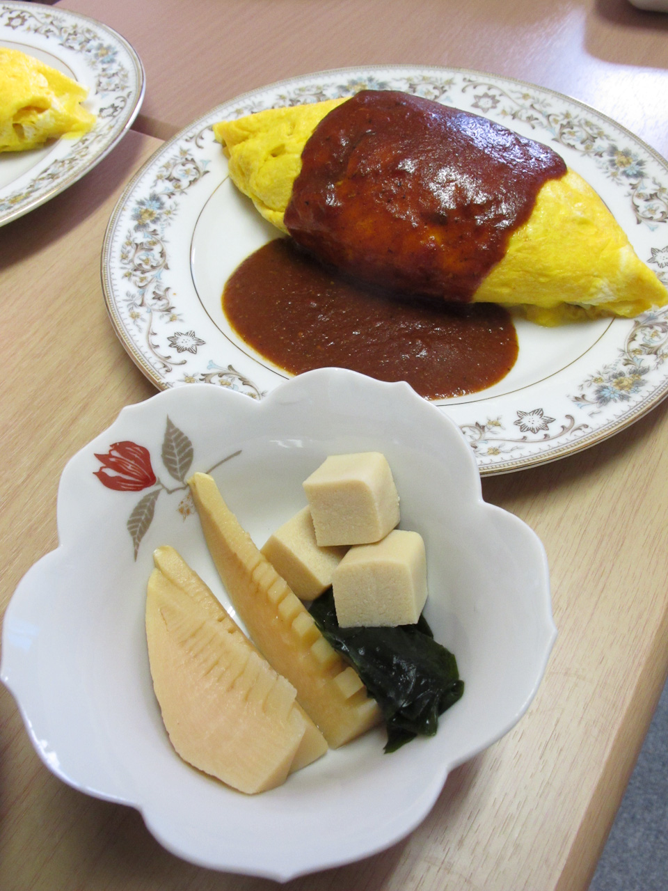
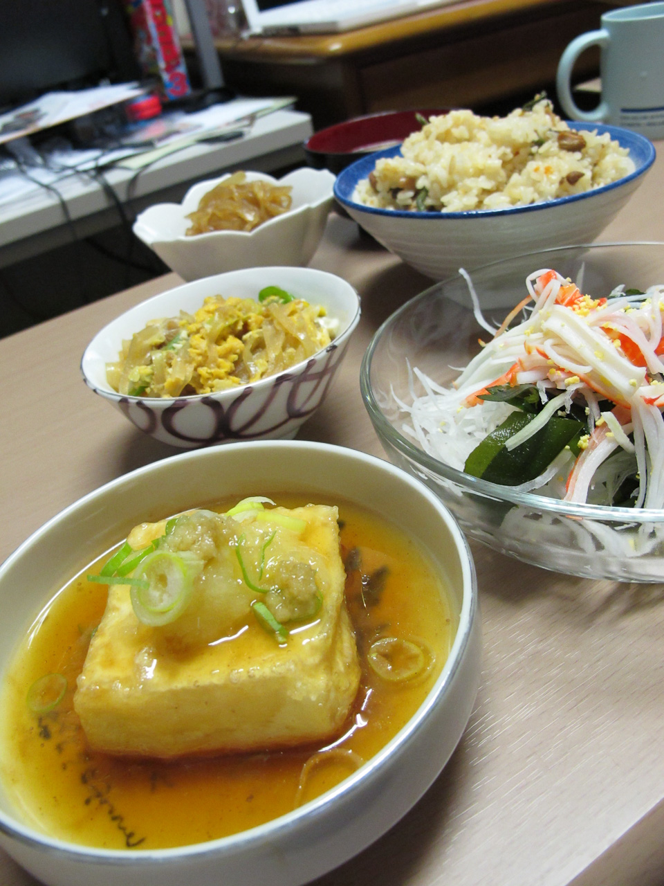
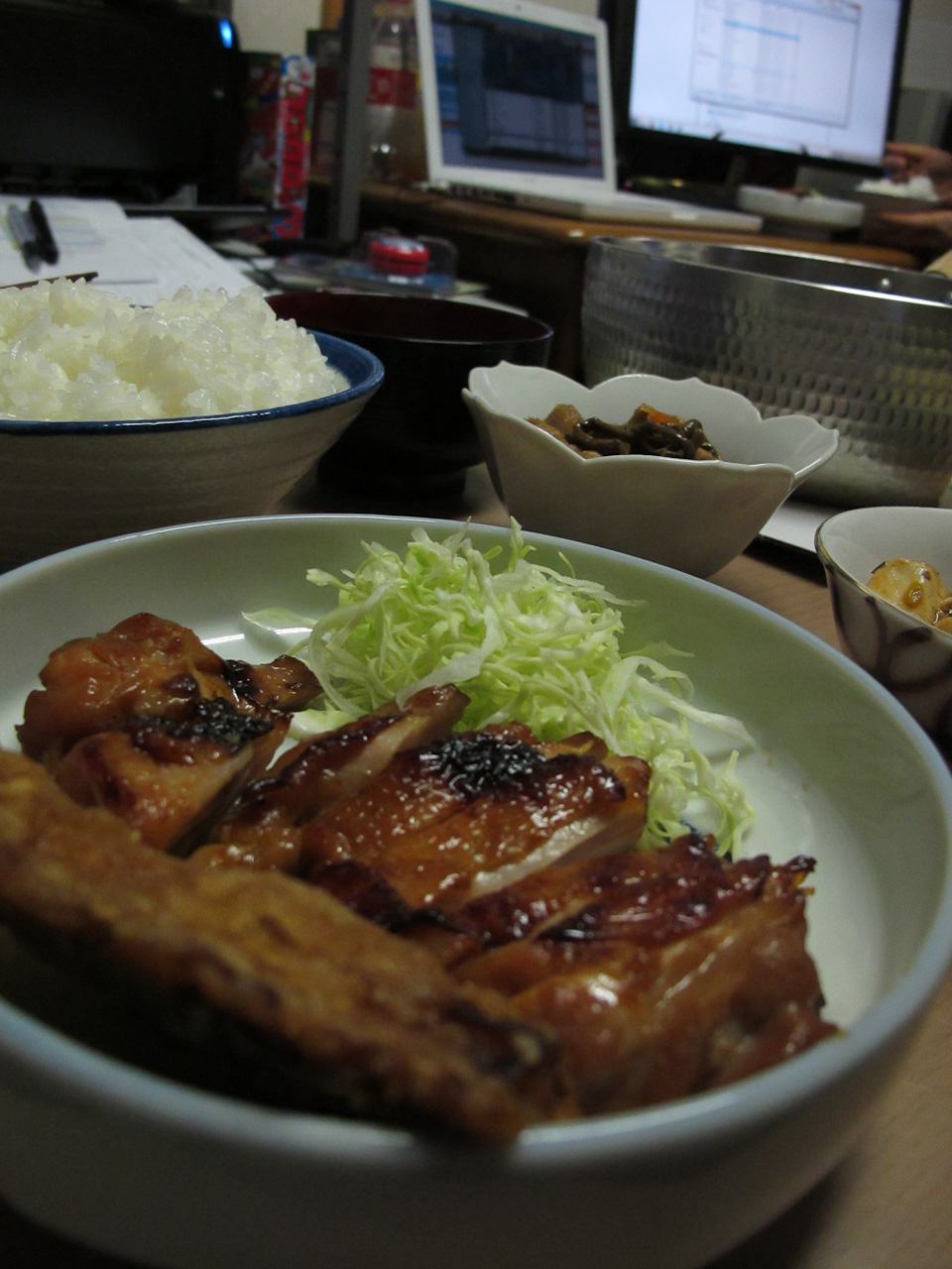
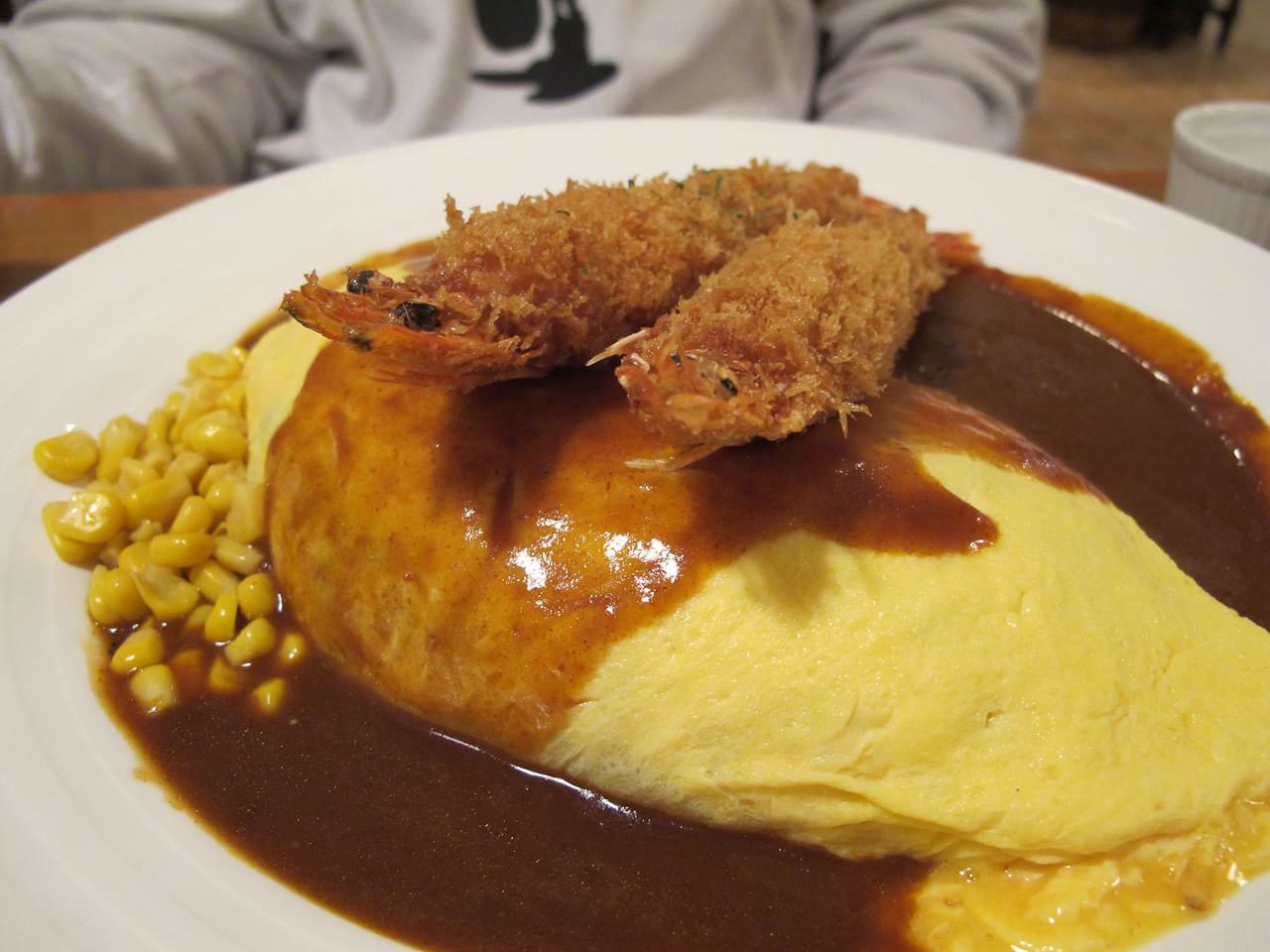
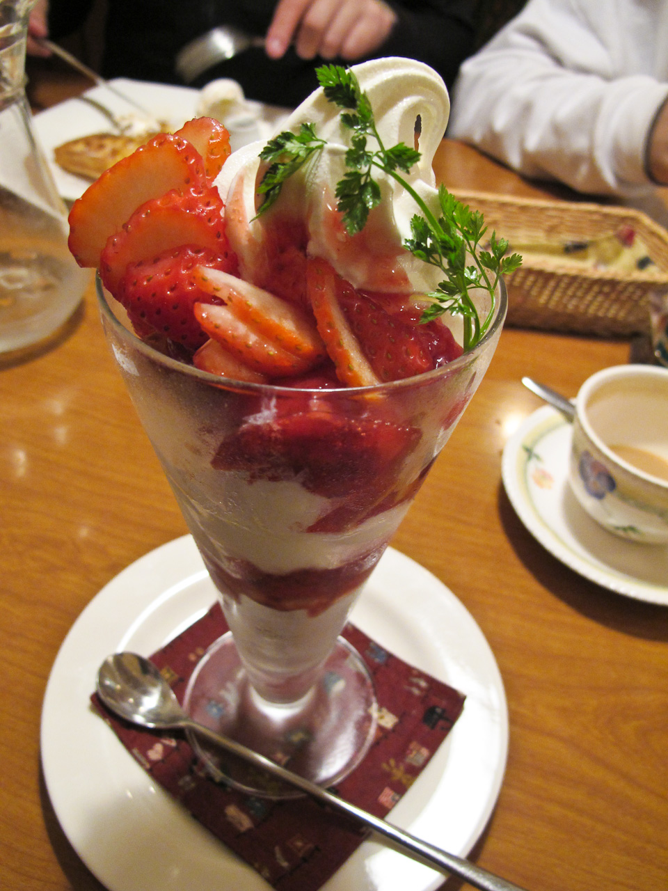
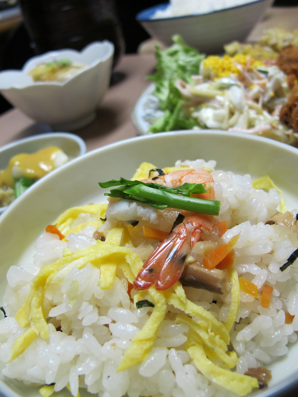
Since I can’t show you the work just yet, you’ll have to live with some more delicious food.


A New Way to look at Data
Sunday, March 14th, 2010 in: Current Events, News
Last year, I read an amazing book called Information Anxiety, written by Richard Saul Wurman, the man responsible for the design of the Yellow Pages. Take a moment to imagine what you would do if you had to index the information for every business in a city. You’re given a stack of papers five feet tall, each page represents one business that needs to be easily accessible in the final product. Wurman took all this data and turned it into the most popular physical business index of the past two decades. People are still receiving and using Yellowpages even now. His solutions are elegant because the form truly follows function–the data determines its own structure, but he’s concerned mostly with the usefulness of information. That’s why the main Yellowpages is broken down into topical categories, so people can find the kind of business they’re looking for. His maps are even more impressive examples of thoughtful information architecture.
Anyways, in Information Anxiety, he talked about the overload of information that comes from our modern predicament of being inundated with data with few tools to actually make sense of it. Information is data that actually has meaning, which means it needs to be processed somehow in order for us to glean any real meaning from it. He saw the daily avalanche of data as a growing force in our lives that prevented us from ever being satisfied with how much information we’ve consumed. He wrote about all this, in 1989. Apparently he’s updated it since the computer boom, but his predictions 20 years ago have proven surprisingly accurate and relevant.
It seems that a few people have also been paying attention to this onslaught of data, and have decided that a new and innovative approach to how we think about information is necessary. Surprisingly enough, some of those people work at Microsoft, and they’ve been working on Pivot, an information browser that itself is a metaphor for the way we should be looking at vast pools of information: zooming in to see the detail, and zooming out to see trends and connections that would otherwise be obfuscated by the body of information itself.
I’m impressed with the level of thinking here, but the one thing Pivot is lacking is the means to semantically tag the data by itself so it can be automatically indexed. It’s no advancement for artificial intelligence, but it does present a new way to look at the data, and a new way to think about the way it’s all connected in different ways. A lot of people talk trash about it because it’s simply an interface to see the data, but interfaces shape the way people look at and think about data, and that can be a game-changer for future generations. It’s so hard to get people to be able to think about fine details, then zooming out to re-evaluate things from a big-picture standpoint. With technology of like that, it could be so much easier to brainstorm as a graphic designer, but more importantly, a generation that grows up interacting with information in this way will be so much more likely to understand how to change their perspective on the information before them.
I’m looking forward to the future.
Himeji and back
Saturday, March 13th, 2010 in: News, Travel
 Finally the morning came that we had to pack our things and head back towards Nagoya. Keiko popped her head in my room before she left for work to say her goodbye, and I thanked her profusely for her hospitality. Around 10am, Ryan let Koyuki into my room to rouse me out of bed. Try staying in bed with an excited dog jumping around you.
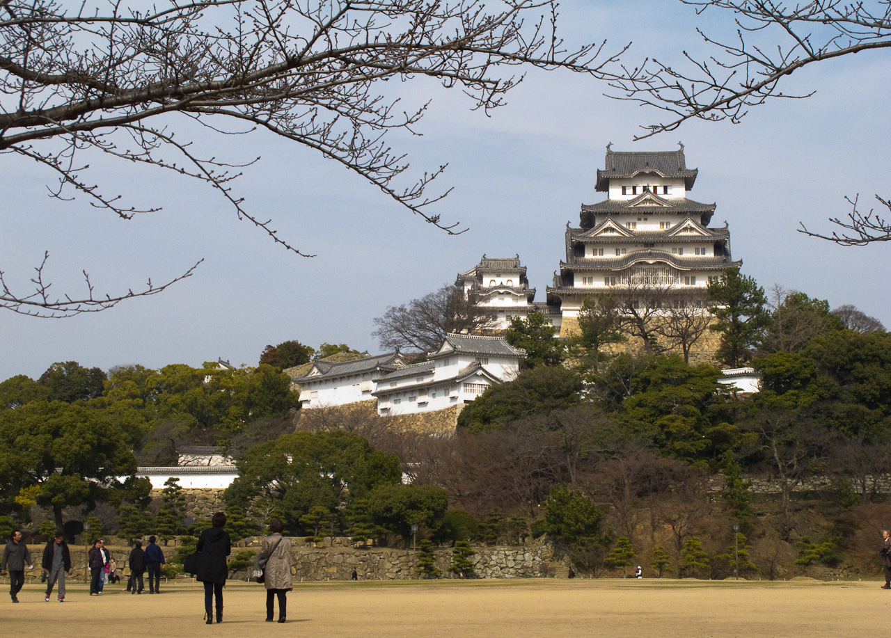
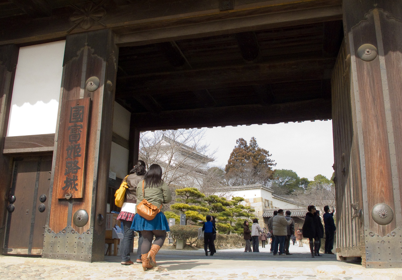
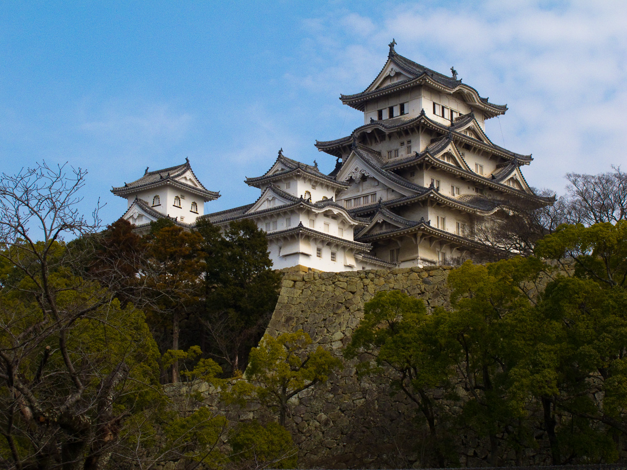
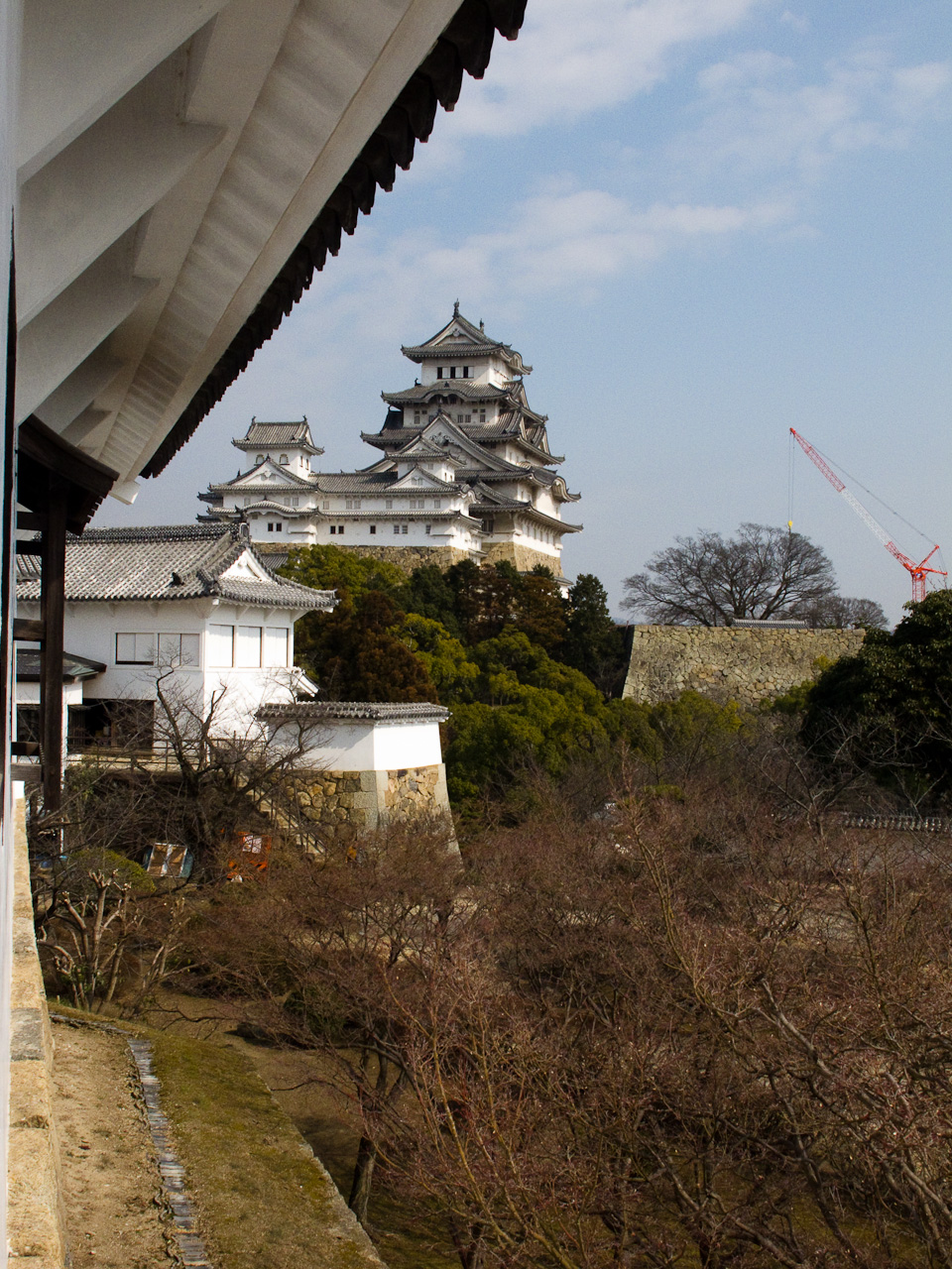
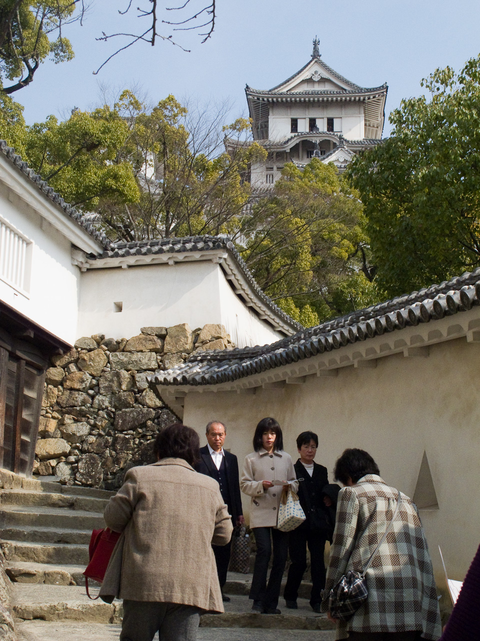
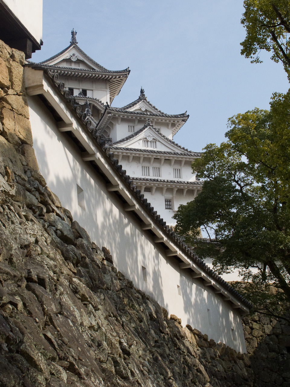
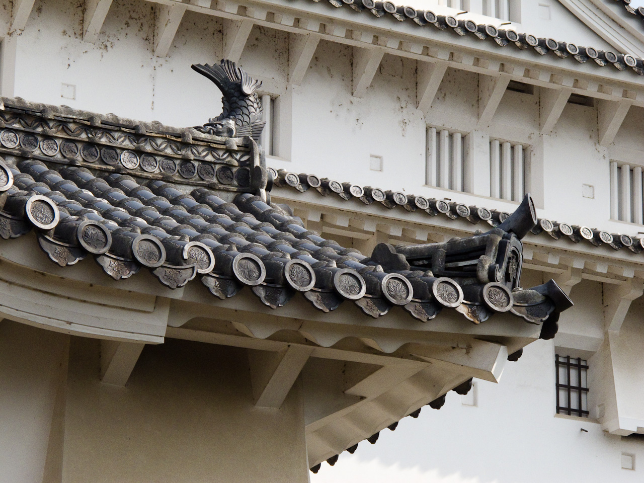
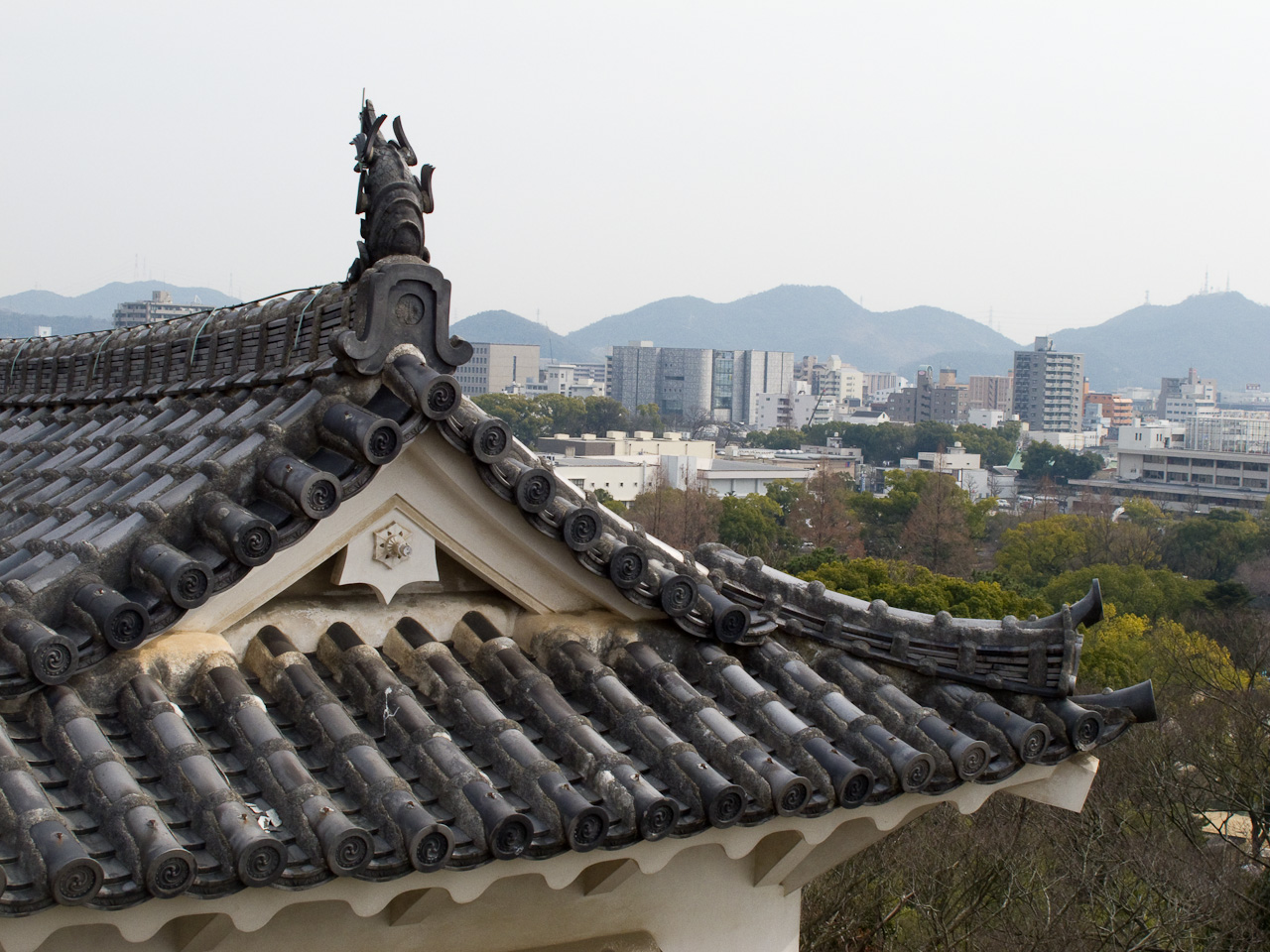
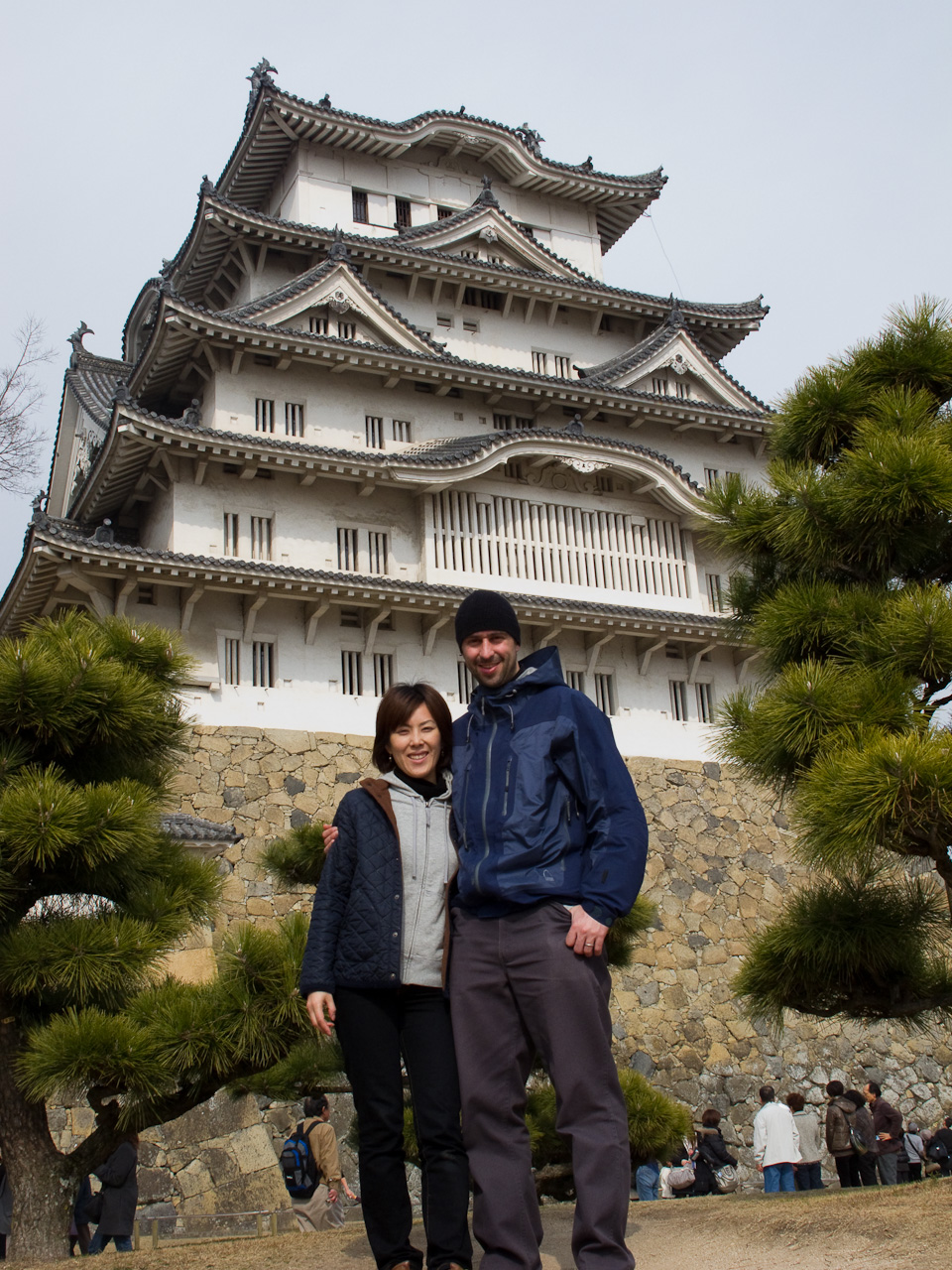
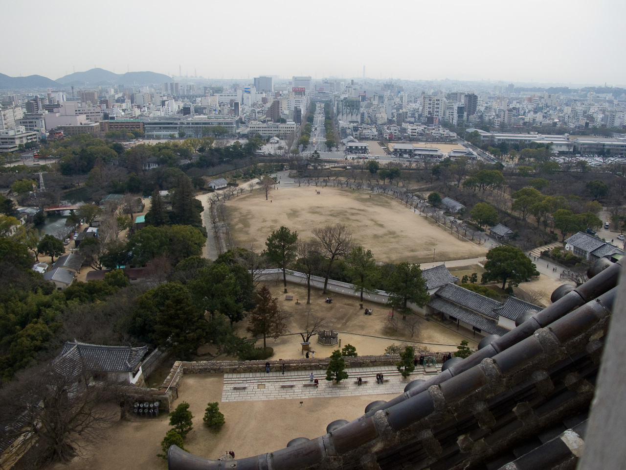
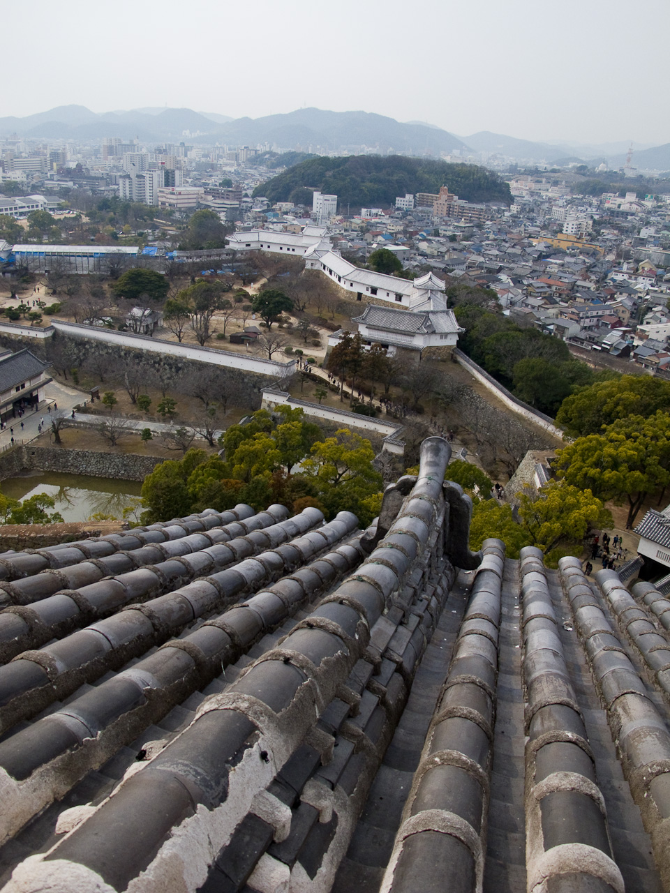
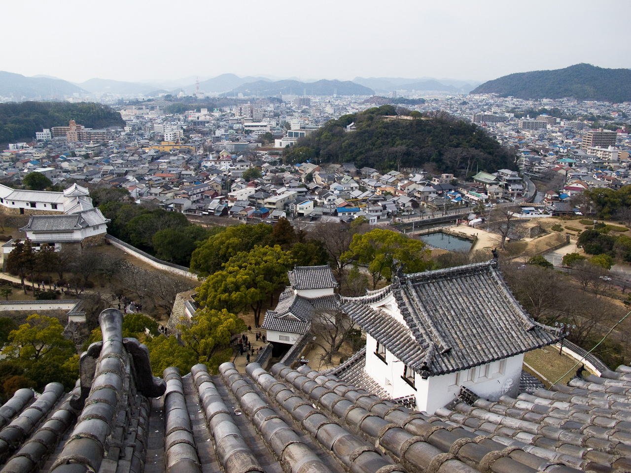
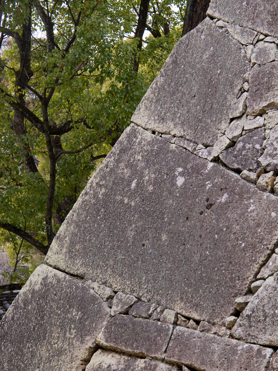
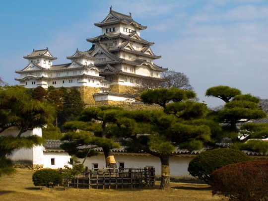
 Instead of backtracking to Okayama to catch the shinkansen, we decided to hit up Himeji castle on our way out. It’s actually in the same direction as Nagoya, so it was a no-brainer. 姫路城, Himeji is the largest standing castle in Japan, one of the three castles deemed National Treasures (国宝), and is also a World Heritage site. The castle itself is pretty enormous, and the grounds are split into multiple levels, as the complex is built on a hill. Because of this, Himeji is also one of the few castles that still towers over the surrounding city. With multiple levels set within rings of moats, people were complaining about how tired they were just reaching the ground floor of the castle. I didn’t have the heart to tell them they still had five stories of steep stairs to climb to get to the top level. Alas, the cherry blossoms had yet to blossom, and from the groves of trees running all the way up to the castle I can tell it will be a sight to behold. However, the castle is closing for renovations in April, for the next FIVE YEARS. So I felt lucky to be able to see it before it gets shrouded until 2015.

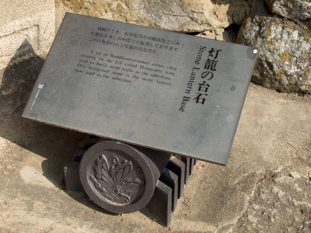
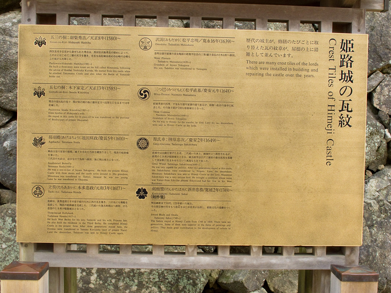
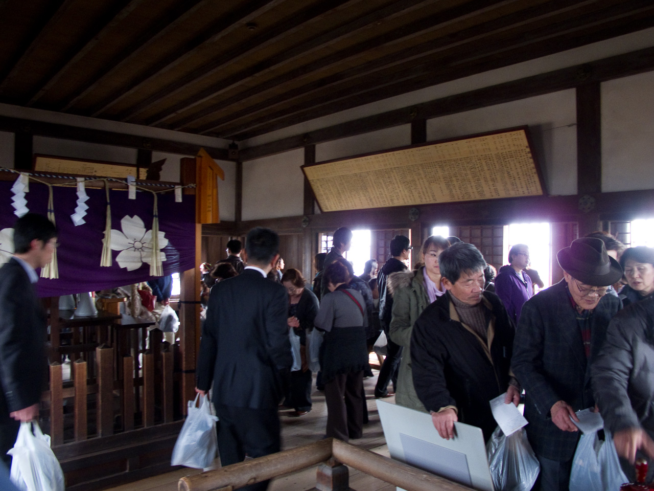
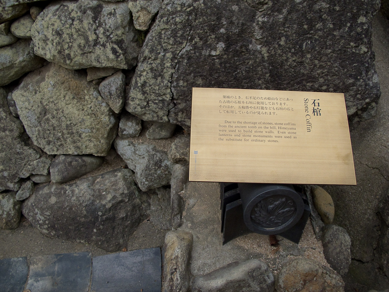
Throughout the castle grounds are countless artifacts and plaques explaining their significance. The construction of a castle requires an enormous amount of stones and it seems that a majority of them are donated by people throughout the realm. Some of the wealthier vassals stamped their mark on the stones to display their contribution to the castle construction. Apparently, there was a shortage of stones during the castle construction, and an old woman who ground grain for her living donated the stone she used as a mortar for the castle’s construction. Toyotomi Hideyoshi was touched by her sacrifice, and the story spread, inspiring many more donations which allowed the castle to be completed. Millstone can still be seen in the wall, alone with stone coffins that were commandeered for the foundation.

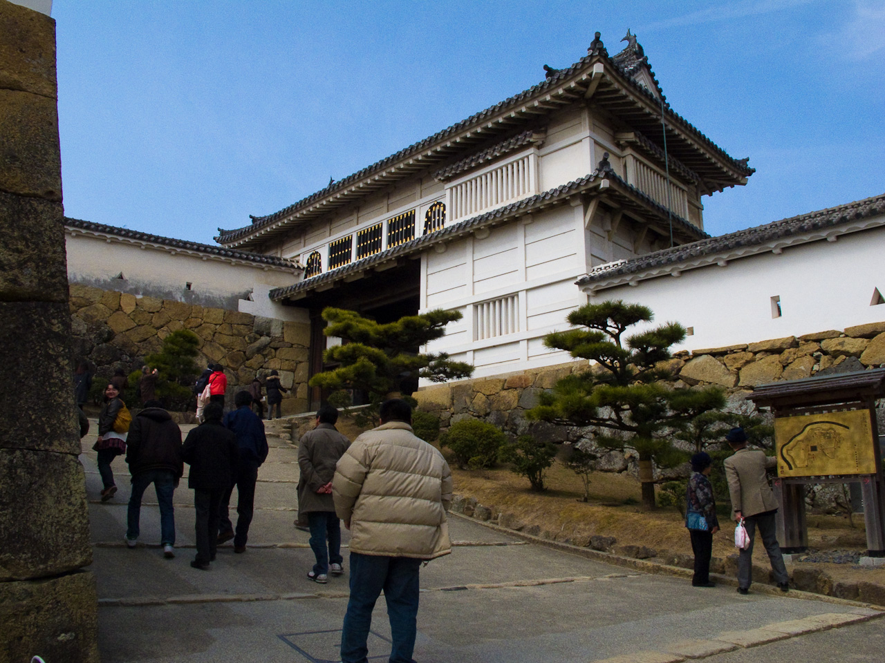
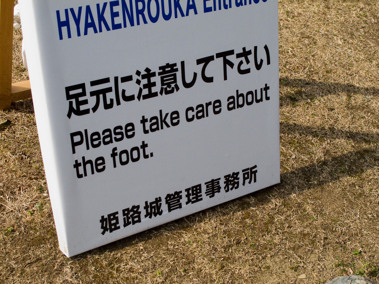
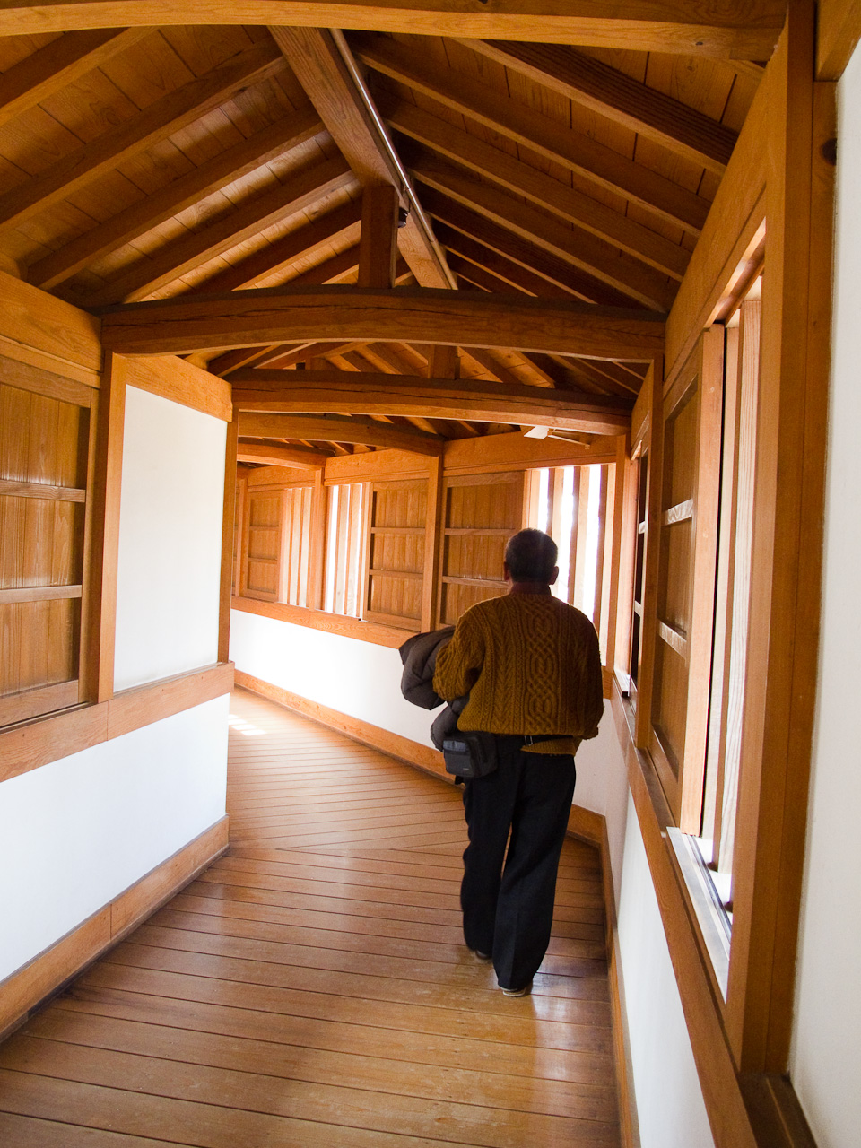
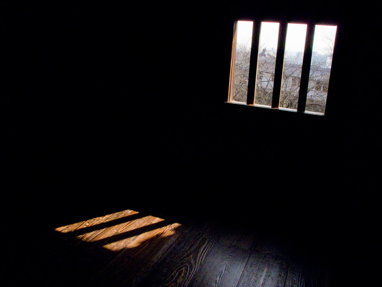
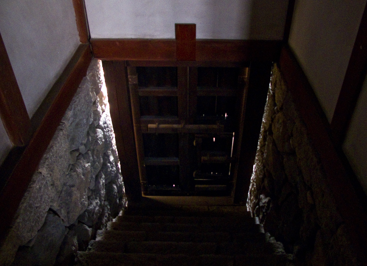
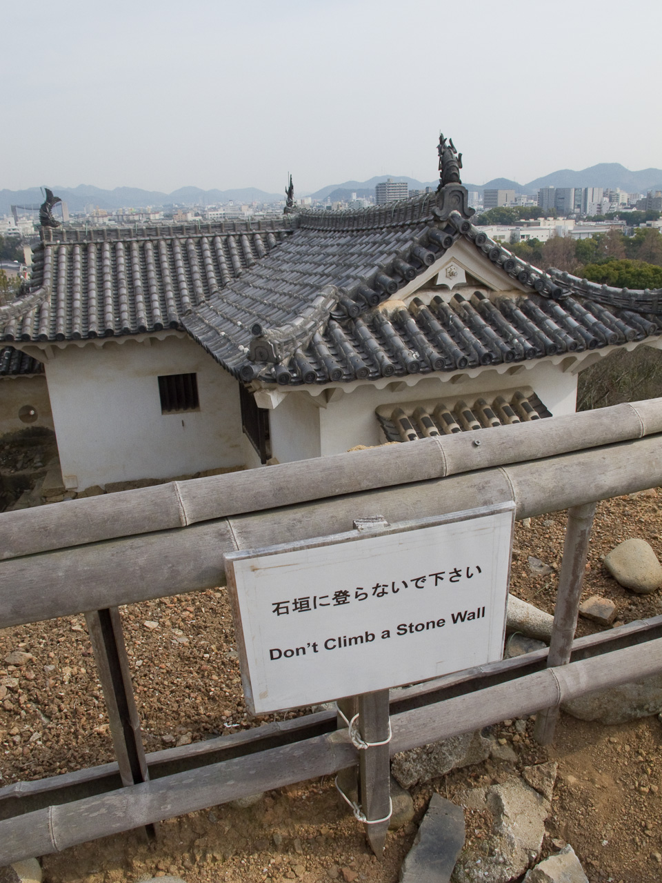
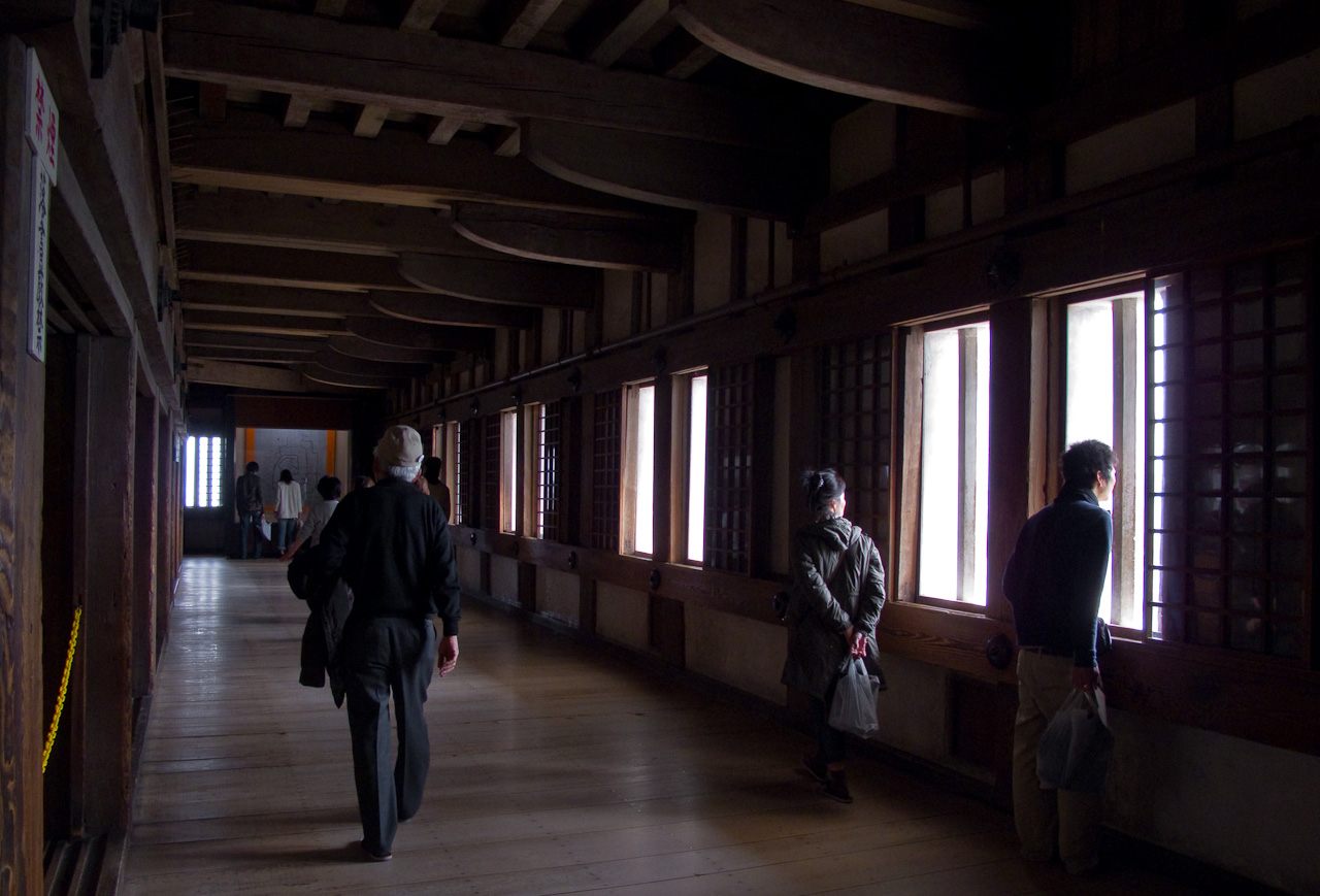
Unlike Okayama castle, the architecture of the building remains in its original state, which means dark corridors and dangerously steep staircases. If it weren’t for the artificial glow of the display cases the only illumination would be filtered through the arrow slats lining the exterior walls. One of the interesting things about these castles is that the interior layout is usually gutted to make room for people to walk around, so although you’re walking around in the same infrastructure, the interior these days is probably nothing like what the original inhabitants experienced. Just a thought.l
Remind me to write an article about Kamon. There’s a lot about the Japanese family crests that intrigues me as a designer. Moving on…
The last little treat on the way out was the okiku well, named for a servant who was falsely accused in a coup attempt and then thrown down the well by her accusers. She’s said to haunt the well to this day. Some cute little kids were standing around the well, asking their mom おきくたん誰?Who’s Okiku? The way they asked was sooo cute.
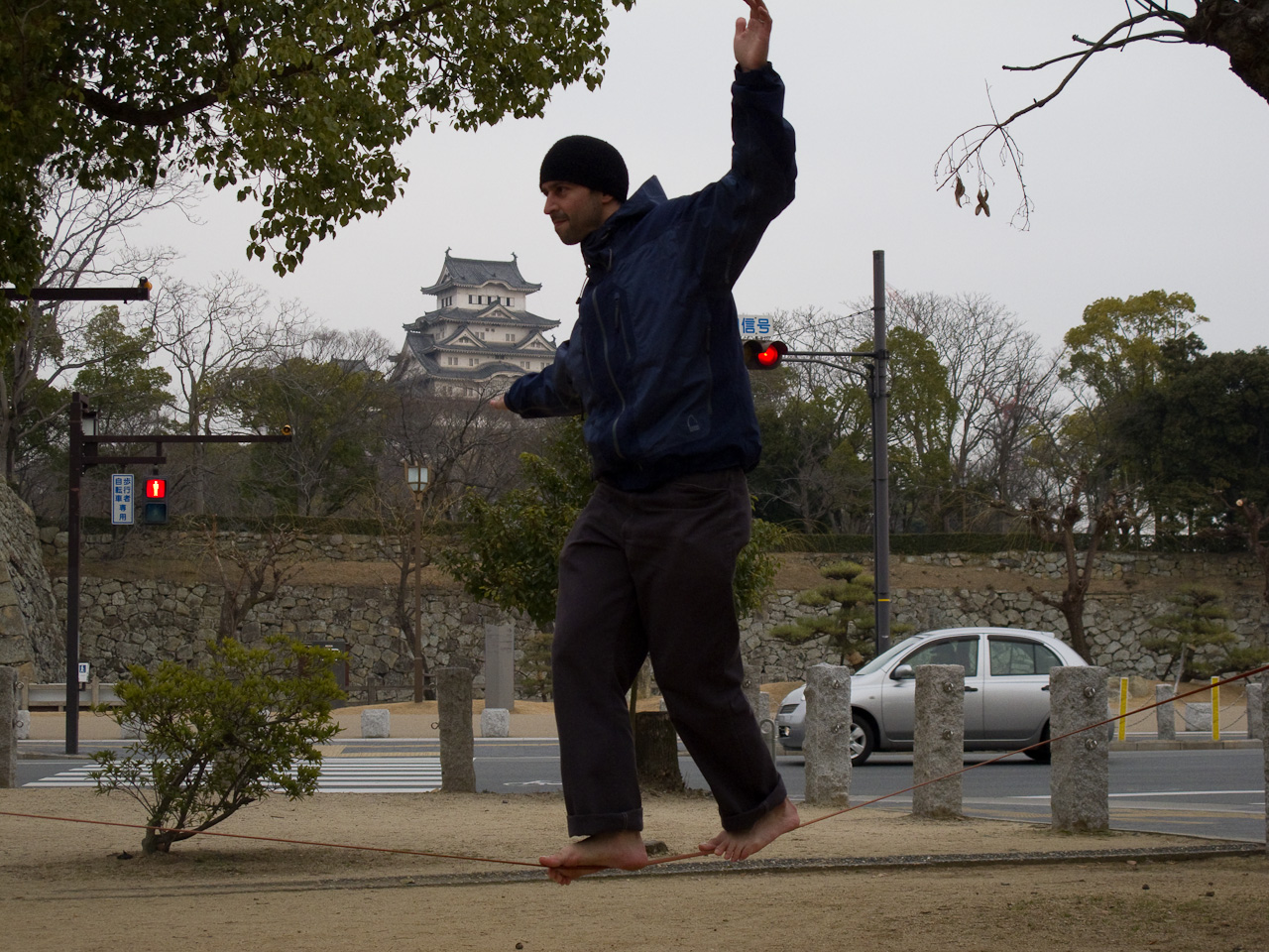
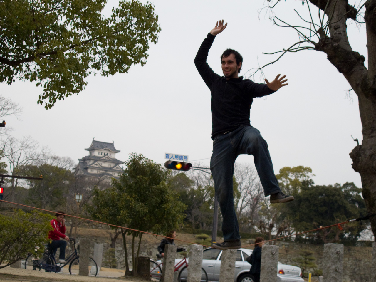
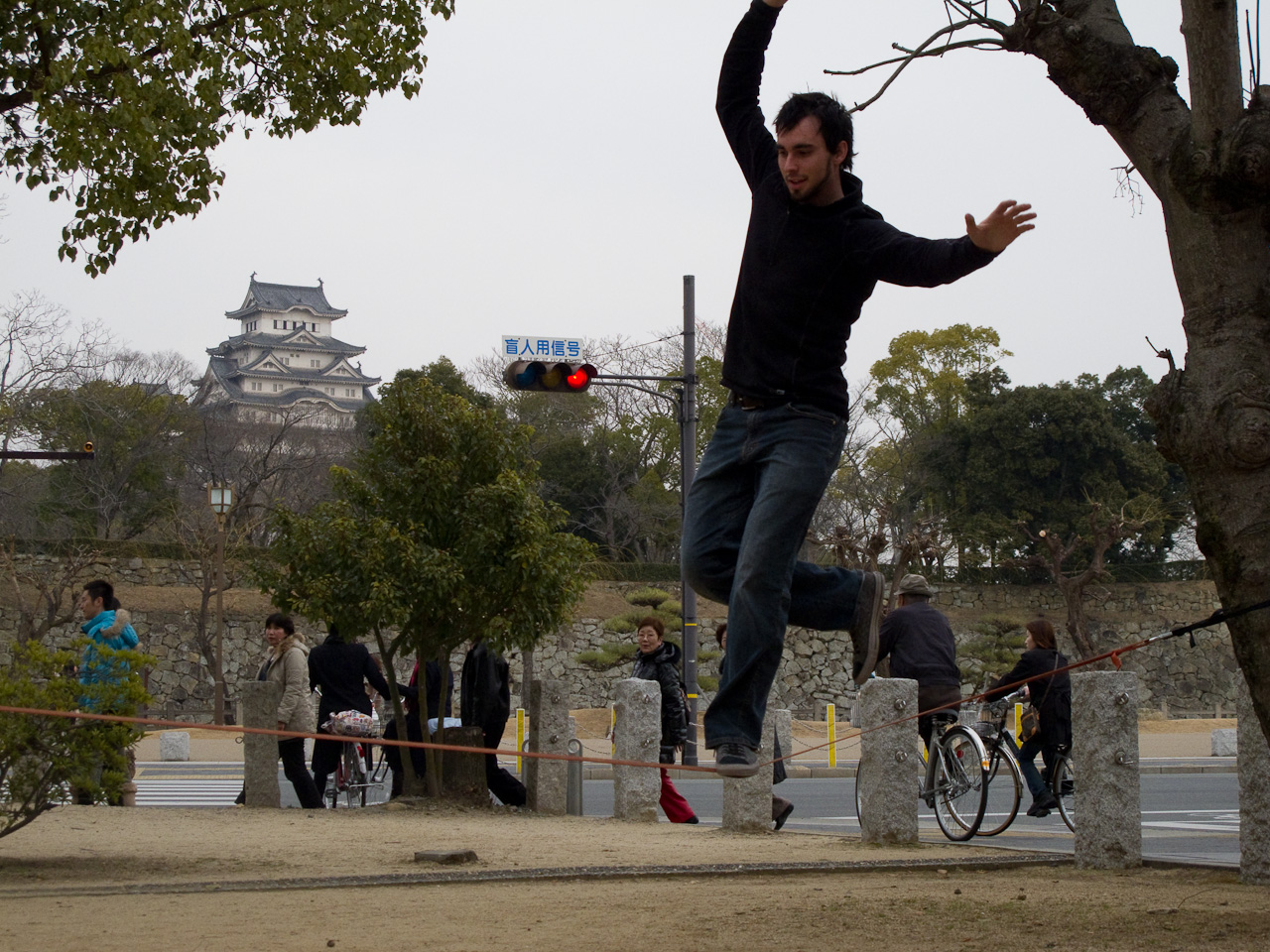
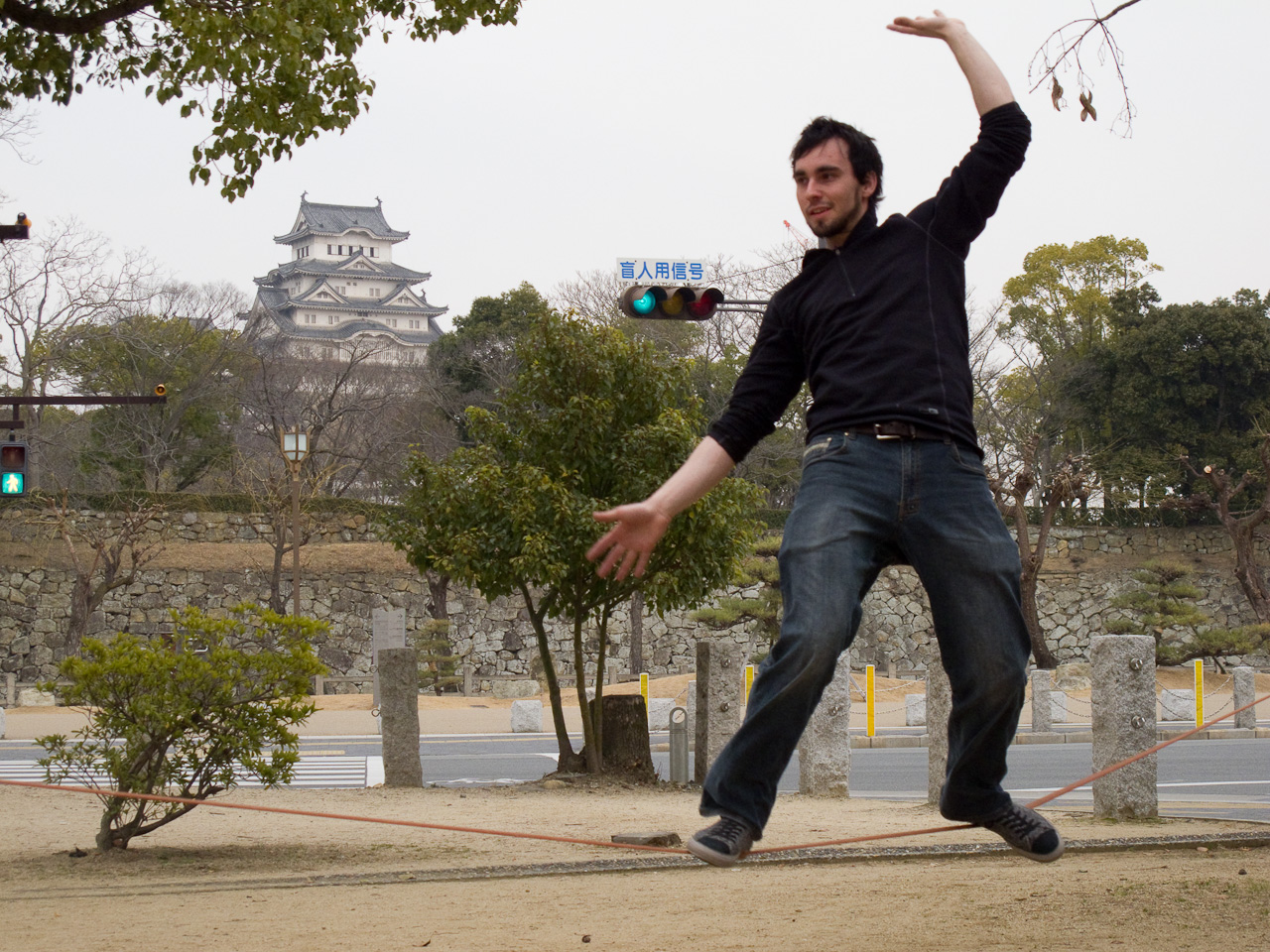
 Before we leave, I have one last thing I want to do! On the way back to the station I detoured to a park in front of the castle entrance, and busted out the slackline. I’d brought it with me to so many places but we never had the opportunity to set it up; no way was I going back to Nagoya without slacklining somewhere, and in front of the biggest castle in Japan is as good a place as any! We played around on the line for about half an hour or so, as crowds of passing tourists gazed on in amazement. Poor Ryan only slacklines barefoot, so he had to suffer the wrath of Japanese park dirt.
httpvh://www.youtube.com/watch?v=Neq2ZrLzchI
The shinkansen back seemed to take no time at all; before we knew it we were back in Nagoya parting ways. I wasn’t able to put into words just how grateful I was for the hospitality he showed me. I removed my hat and gave him a bow. It seems that gratitude transports me back to 18th century England.
When I got back home I shared the kibidango I’d brought as omiyage with the guys, and Hiro asked me when I intended to leave Nagoya. He’d called while I was still in Okayama, asking the same question, and I was a little nervous about it because I always doubt if people really enjoy my company. To my surprise, he elaborated with “The longer you stay, the happier I am.”
I need to stop doubting things so much and just accept that people actually like me sometimes.