REWIND Store Identity
Friday, March 19th, 2010 in: Identity
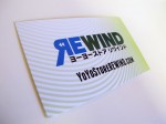
The Store identity for Yo-Yo Store REWIND, www.yoyostorerewind.com and www.RWND.jp
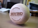
The logo is based on some wordplay, reversing the shape of the R and using the traditional “rewind” icon from the days of VCR technology; a visual metaphor for the revival of our old friend, the yo-yo. The font is a highly modified Fontworks FOTロダンNTLG Pro demi-bold typeface.
Encapsulated in a stroke or series of strokes, depending on the application and environment, the shape of the logo is similar to a “speech bubble,” an element that will be explored later once the brand has established itself. Once the public associates these visual styles and colors with REWIND, the backwards R shape is intended to become a standalone visual element in the future as well.
The color scheme is an analogous “transparency” of blue and yellow-green, creating the dark green middle ground. This creates a layered dimensional effect to the logo without having to use extraneous elements.











Leave a Reply