Japan National Yo-Yo Contest Rebranding
Monday, March 18th, 2013 in: Identity
![]() For a while, Hiro has asked me to think of new design ideas for the Japan National Yo-Yo Contest. They had been using the original logo for many years, just changing the date, and they were ready for a branding reboot.
For a while, Hiro has asked me to think of new design ideas for the Japan National Yo-Yo Contest. They had been using the original logo for many years, just changing the date, and they were ready for a branding reboot.
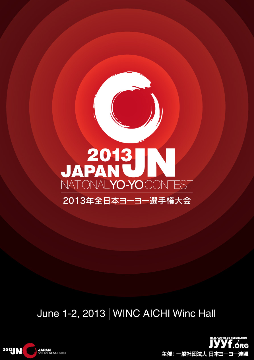 I wanted to do something simple that evokes the spirit of Japan but also relates back to the yo-yo. In Japanese iconography, the Zen symbol called “Enso” is one of the most simple, yet striking designs. The brushed circle represents endless cyclic existence, and I found it a good analogy for the endless spinning of a yo-yo. The red circle is also prominently featured on the Japanese flag, so I created a stepped circular backdrop for the contest poster.
The design has a few variations for use across print and digital media.
Information about the 2013 Japan Yo-Yo League can be found here

The design was adapted for the Japan Yo-Yo League, and also to create backdrops for the yo-yo contests. All JYYL yo-yo contests in 2013 now use my designs, which hint at the upcoming Japan National Contest by cropping out the backdrop.

This is the winner’s circle at 2013 Central Japan Yo-Yo Contest, with REWIND’s Shinya Kido taking first place! Shinya is also wearing a REWIND + yoyorecreation collaboration shirt that I designed for sponsored players. Below is a video of Tatsuya Fujisaka taking 1st at the East Japan Yo-Yo Contest.
httpvh://www.youtube.com/watch?v=Etd6fR12H4o


Leave a Reply